
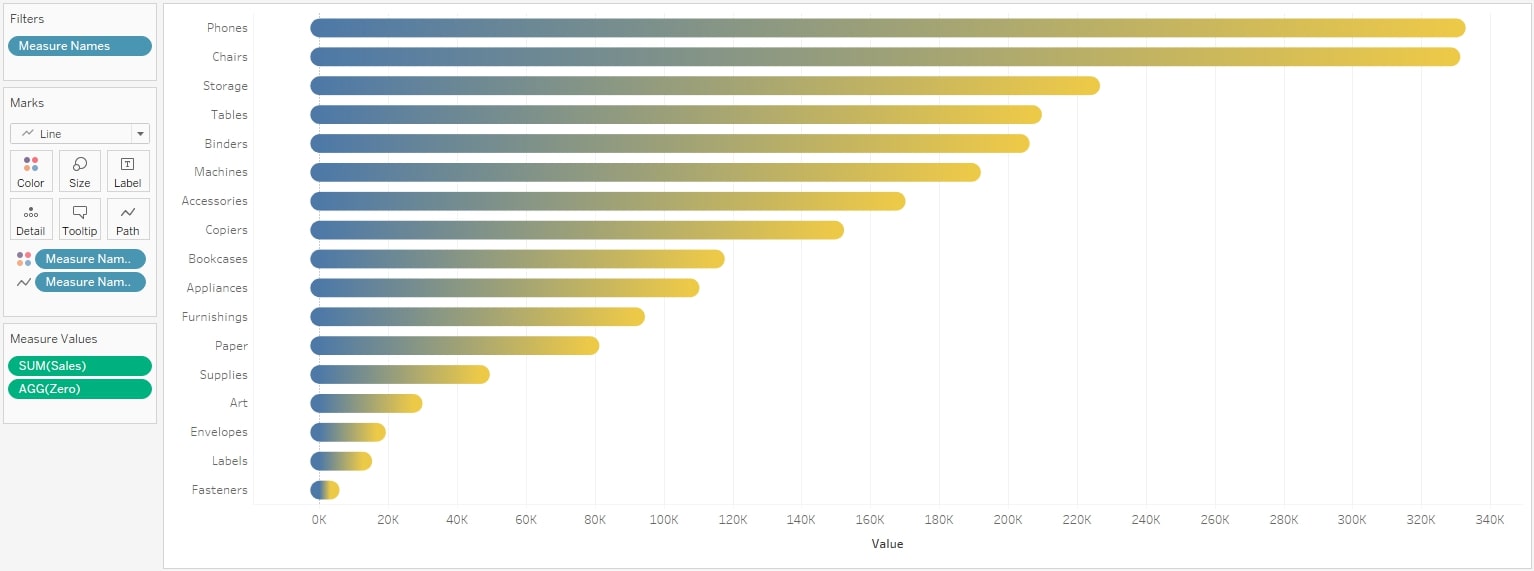
When I do lead a Tableau Desktop training, the very first thing we do within the tool, is build a simple bar chart. It’s pretty straightforward; Drag a measure onto your Rows shelf, and there it is. As the margin for error is even lower than with placing the measure somewhere onto the Marks card (smaller areas to drop the pill), I dare to say: It cannot get more basic than this.
But what if we wanted to build those bars a little bit differently? What if we wanted round bars? Here, it becomes not so basic anymore. To the contrary, it’s getting advanced quite quickly as Tableau does not offer this visualization type natively.
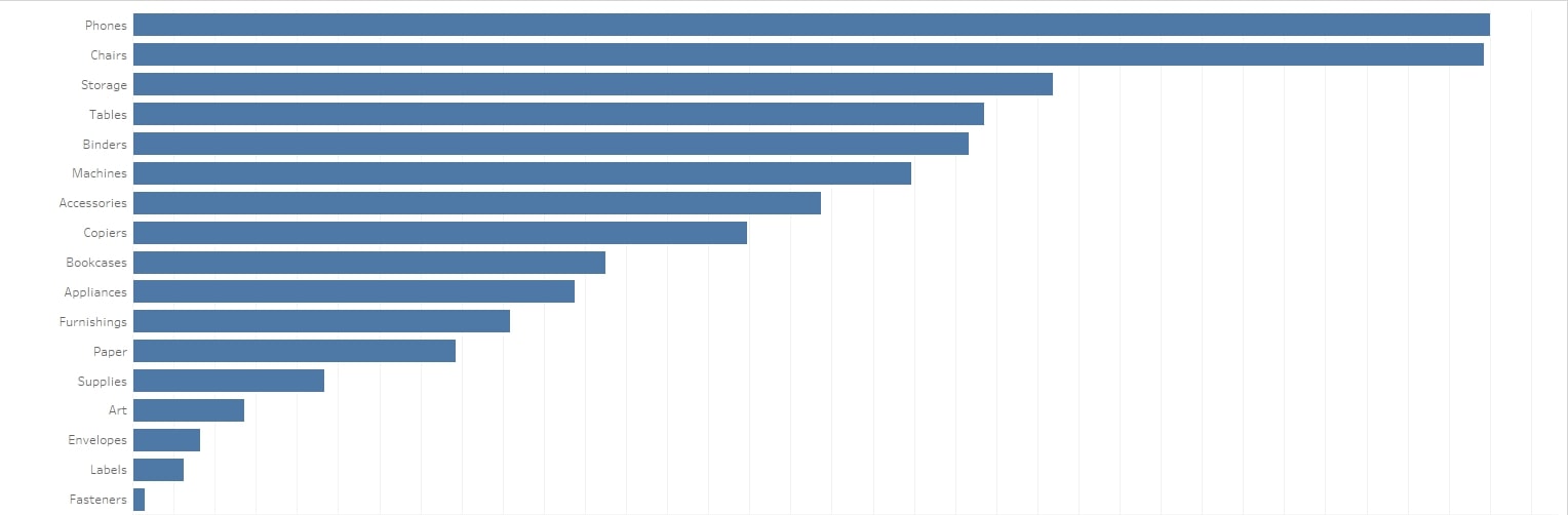
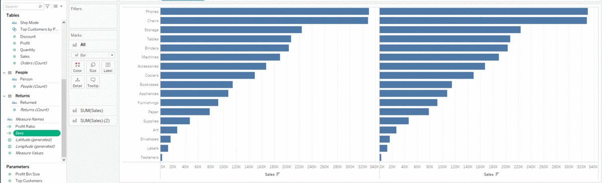
So, how do we get from this …
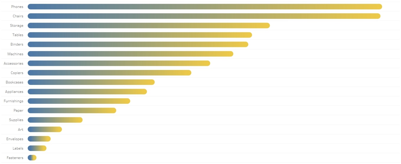
… to this?
Here’s the good news: once you know how it works, it’s simple again. The bad news? Well, there isn’t really any. So, let’s dive in and build rounded bars! There are at least two ways of accomplishing this. I will walk you through both of them.
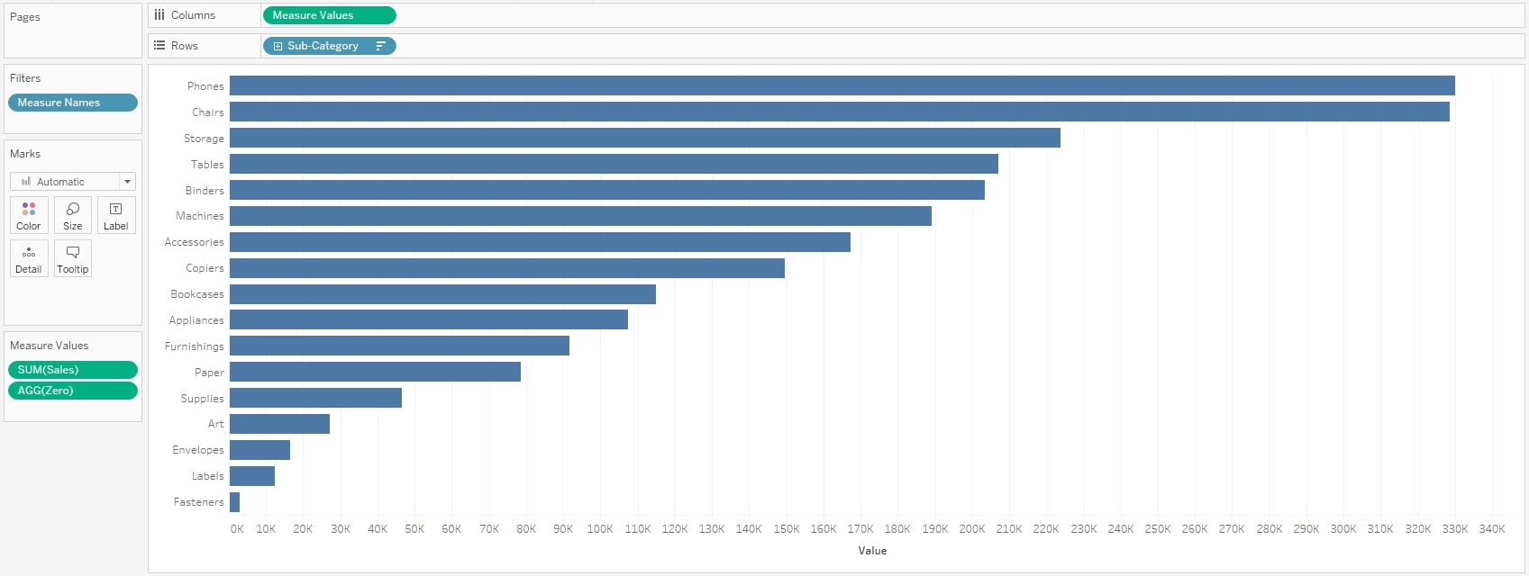
First, we have to build the bar chart. We are going to use the Global Superstore data in these examples:
- Drag [Sub-Category] onto Rows.
- Drag [Sales] onto Columns.
- Sort the bars descending.
- Set the Mark type to bars. (Even if Tableau did this automatically!)
In the end, you should have the same chart like the one at the top (in the first image above).
Solution 1: Dual Axis with Circles
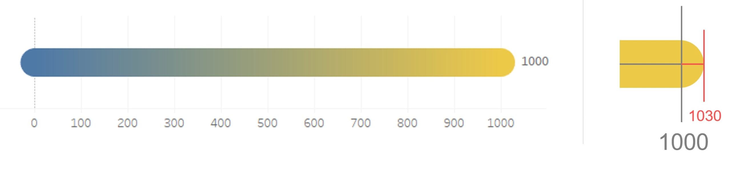
The goal is to create circles as starting value and ending value of the bars. Then combine the circles with the bars to make both look like rounded bars.
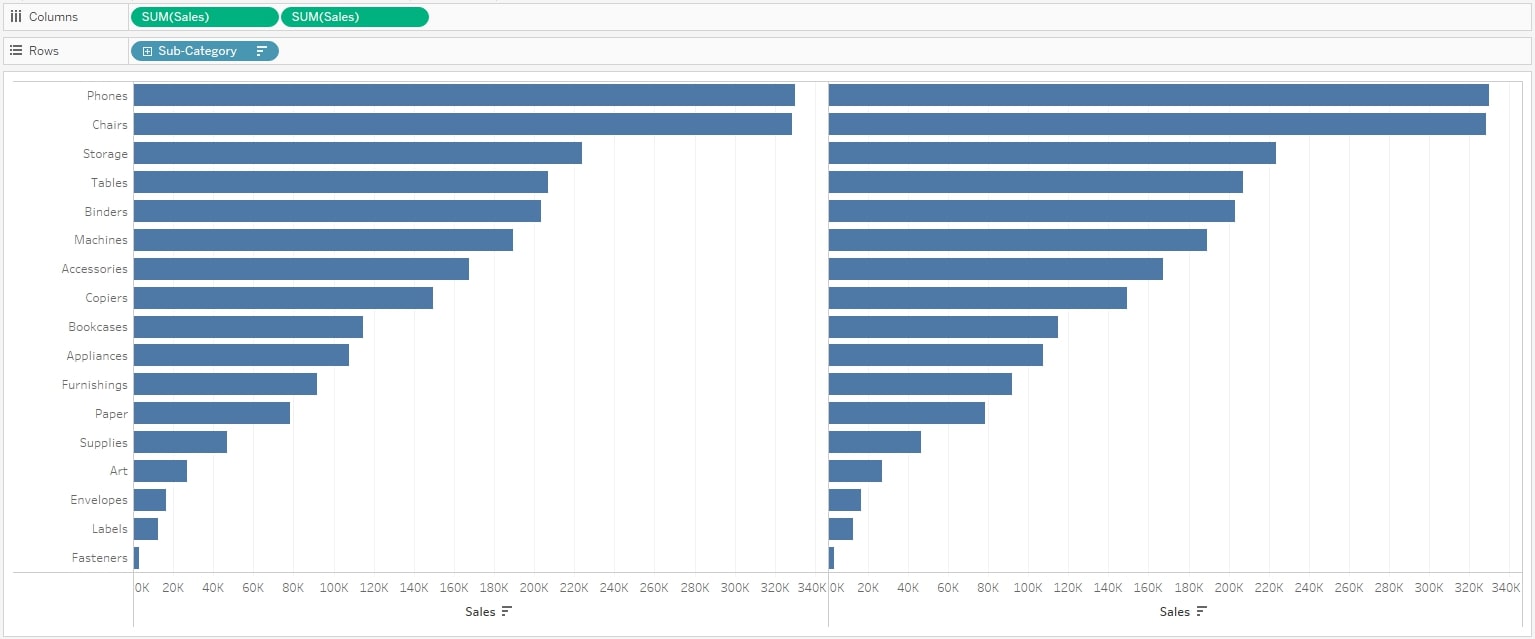
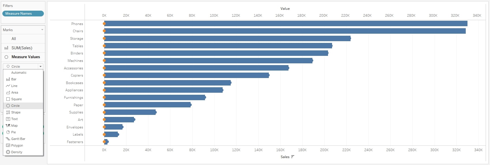
1. Duplicate [Sales] on Columns, so you have two same bar charts:
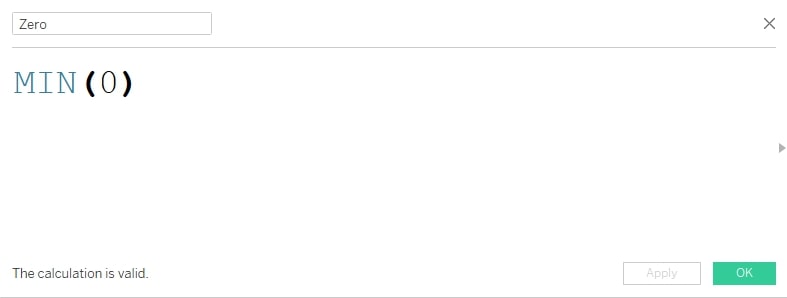
2. Create a calculated field (I am calling it Zero) and type in the very minimalistic function:
3. Drag [Zero] onto the axis of the right bar chart, in order to create Measure Names and Measure Values in the view. Then get rid of the [Measure Names] that appeared on Rows:
4. Convert the original [Sales] and the [Measure Values] on Columns into a Dual Axis. Right-click the green pill on the right and choose Dual Axis. No screenshot here because your view should look almost like the one when we were starting, only now you have two axes instead of one.
5. Set the mark type to Circle for the [Measure Values] pill:
6. Make bars and circles the same color. Either remove all [Measure Names] instances that are on Color in your Marks card or just set the same color in the color menu. Here, I recommend the first one as we need different colors for [Measure Names] in the second solution later on.
7. Synchronize the axis by right-clicking on one of the two axes and choose Synchronize Axis.
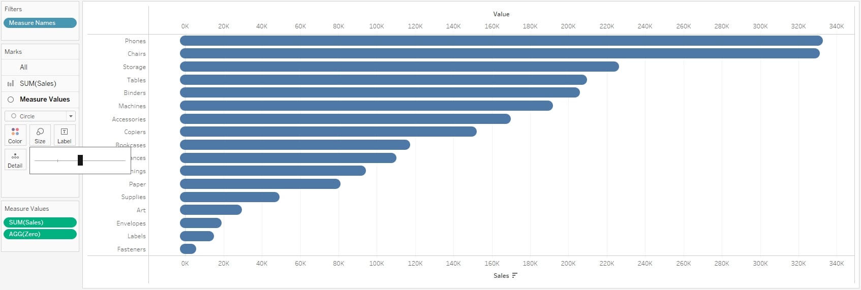
8. Adjust the size of the circles, until they match the size of the bars:
And we’re done! Rounded bars.
Solution 2: Pathways
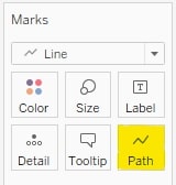
But there is a cooler way to produce rounded bars. A fairly underestimated feature in Tableau is the use of the Path button on the Marks card:
And this is exactly what we are going to do next. Once again, we are starting with a simple bar chart as scripted at the top of this article. Then follow these steps:
1. Create a calculated field labeled Zero with the simple calculation MIN(0) in there. If you followed the first example, you’ll already have that one. You can use it again here.
2. Drag [Zero] onto the axis of the bar chart in order to create Measure Names and Measure Values in the view. Then get rid of the [Measure Names] that appeared on Rows, similar to what we did in the first solution. The view should look like this:
3. Set the mark type to Line, and don’t be alarmed when the chart looks a bit funny after that. We are going to fix it in a second. Note that the button Path appeared in the Marks card:
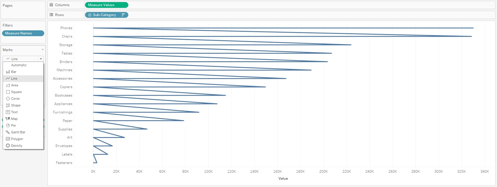
So what is happening here? When we told Tableau to make the marks into lines, Tableau did exactly that: The line (former bar) starts at the first value in the view (Phones, in this example) and goes back to its zero line because this is where the first value from the field Zero is. From there, it goes to the second value (Chairs), from there to zero, and so forth. Tableau does not know how we want it to look, so it just follows the data. In the next step, we will use this behavior to our advantage.
4. Drag [Measure Names] onto the button Path:
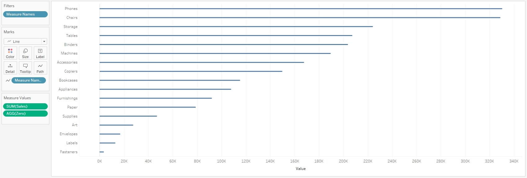
As soon as we drag something onto Path, we define what path our lines take. In our case, we dragged [Measure Names] onto Path, and there are two measures in there: [Zero] and [Sales]. So, the path of our lines begins at zero and ends at the respective [Sales] value of each Sub-Category.
5. Adjust the size of the line:
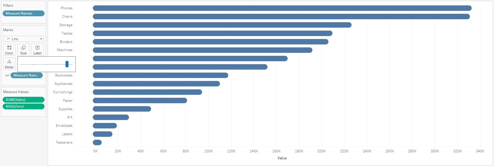
And there we are! Again, rounded bars. Cool, right?
The Pathway solution is a bit more advanced, though at the same time simpler than the Dual Axis solution. It is also cleaner: We don’t have to sniper the exact size of circles and bars to match them. And while you can color the circles differently in the Dual Axis solution (you might want to do that to highlight the round ends of the bar), you can color the whole bar in quite a fancy way with the Pathway solution:
6. Optional: Drag [Measure Names] onto Color in your Marks card:
Doesn’t this look nice?
A Word on Rounded Features in Data Visualizations
As always, when there are circles or round things involved in data visualizations, we get into the discussion around whether or not the aesthetics of our view trump the accuracy of our view. If pie charts could talk, they would probably make a case that they are being mobbed.
The argument with rounded bars is that the viewer cannot be sure where exactly the bar ends. Does it end where the rounded part begins or does it end where the rounded part ends? Of course, the truth is that whenever we deal with circles (same with our Pathway solution), the center of the circle is the mark of the data—meaning rounded bars seem bigger than their actual value:
I will still defend rounded bars. They work best when we don’t need to see written numbers next to them. Let’s not forget: the viewer might not be interested in the numbers at all. He or she usually wants to see the relation between the bars – which one is bigger than the other? As the rounded bars do that like any other bar chart, it becomes a question of aesthetics. And, at least to me, rounded bars look far more pleasing to the eye.
If there is one thing I have learned when dealing with visual analytics, it’s that the end users who are actually using our visualizations and dashboards need to have fun when they do it. There is no better way to raise adoption rates and make them feel comfortable, even in the most complicated dashboards!