Politics are … tricky. I firmly believe that data has its place in every part of the world. However, I also know that data can be biased, especially in its presentation. So, when designing for data, how does one navigate these biases? I’m not sure anyone has the right answer, but I wanted to share my journey in creating a viz centered around the core of American politics: voting.
You should always consider biases when creating a viz, but it feels especially important when making a viz with social implications. In this post, I will discuss the different precautions I took to try my best to be socially conscious and cautious when creating a viz.
There are three major sections that I will be focusing on: The Story, The Data and The Design.
The Story
Stories can often be found in the data, but data can also be used to tell a story. There’s a place for both: if you are creating a dashboard for decision-making, you probably want the data to do most of the talking. If you are telling a story, it’s often more effective if you have some data to back you up and add some authority. Inevitably, you will lean more toward one of these purposes, so it’s important to choose one and be aware of it throughout the dashboarding process. In this dashboard, I decided to lean into telling a story. The story was certainly driven by the data, somewhere in the constant loop of exploration and interpretation.
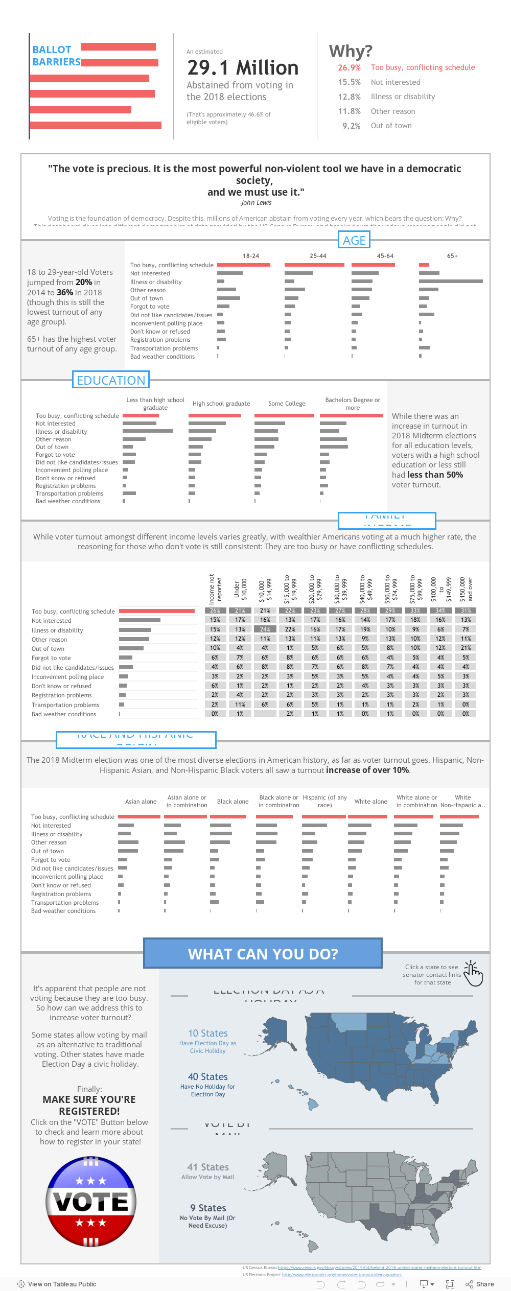
Consistently, “Too busy, conflicting schedule” was the number one reason for not voting for each demographic. So rather than try to be unbiased and hope that the user would arrive at the same conclusion, I decided to focus the story on this.
Next, I needed to decide the goal of the dashboard. I could aim to show the data as unbiased as possible. This seemed especially tricky, partially because of the passion I have for the topic but also because I was so compelled by the story I found. Instead, I made my goal to spark conversation. This gave me room to tell a more specific story, but it also made my dashboard a bit more biased and controversial. It’s a slippery slope, so it’s important to be aware of it.
The Data
We often think of data as unbiased and factual, but the collection and aggregation of the data can often be biased or misleading. It is therefore the responsibility of the designer to vet and analyze the data being used. Because voter information is extremely valuable, hard to collect and often biased, I decided to try to minimize the number of sources I used.
The U.S. Census Bureau aims to “serve as the nation’s leading provider about [the U.S.’s] people and economy.” After looking through the methodology and some reviews of their data, I decided to make the U.S. Census Bureau my sole source. I did this for two reasons:
- My goal was to start a conversation, not to explain the current state and causes of voting abstention.
- Multiple sources are often needed to be accurate; however, I thought that would be too large and distracting of a rabbit hole for both myself and the audience of the dashboard.
The Design
The first thing you may notice about the dashboard are the headers for each section. It is not best practice to inconsistently scatter the headers in different places. I did this intentionally in an attempt to combat apophenia, also known as patternicity. Apophenia is when a person tries to see a pattern or make connections when no such relationship exists. This was certainly inspired by “How Not to Visualize like a Racist,” which has many more great tips.
For example, there were three categories in which “illness or disability” was the number one issue:
- 65+ year-olds
- Less-than-high-school-graduate education
- Family income between $10,000 and $14,999.
By causing the viewer’s eye to jump around to the header, I was hoping to avoid the apophenic assumption that “65+ year-olds with a family income between $10,000 and $14,999 and less than a high-school-graduate education are especially unlikely vote because of illness or disability,” even though we don’t actually have data for that specific group.
It’s important to disaggregate the data as much as possible, as explained more in depth by this wonderful article by Eillie Anzilotti of Tableau, called “How to viz responsibly as you work with data on systemic racism in the U.S.” This is another reason I kept it to one data source—so I could dive into this source as disaggregated as possible, instead of show just the potentially misleading totals.
Next, I adjusted the colors of the bottom section. This section is where my bias was most at play. I hoped differentiating the colors would make it stand out from the rest of the viz, both indicating it as a call to action and highlighting some assumptions on my part.
Finally, I tested the color schemes for people with color deficiencies using ColorOracle. I found that some of the “storytelling” coloring was lost for those with Protanopia. However, the data itself was still clear and distinguishable.
My Main Takeaways from the Process
- Don’t be afraid to tell a story.
- Don’t be afraid to stray from best practices, as long as you do it with intention. “Best Practices” aren’t always the best practice for a specific story/audience.
- Be prepared for feedback: you probably won’t get everything right. Embrace the learning!
- End with an easy call to action! Minimize the steps the audience has to take to make a difference!