
Oftentimes, we want to show the labels on charts, but there may be cases where we need more flexibility than the default options Tableau provides. For example, we may only want to label the most recent data points or select points of particular interest. In this post, we will see how you can get full control of your labels by using table calculations.
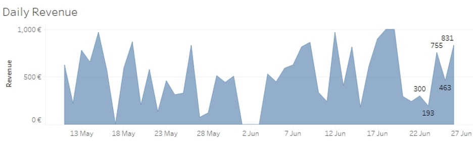
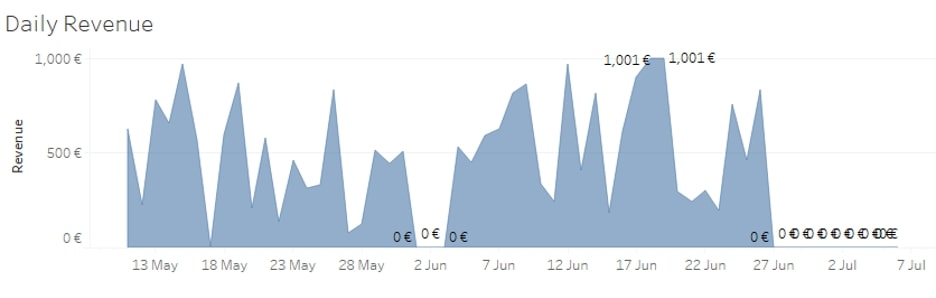
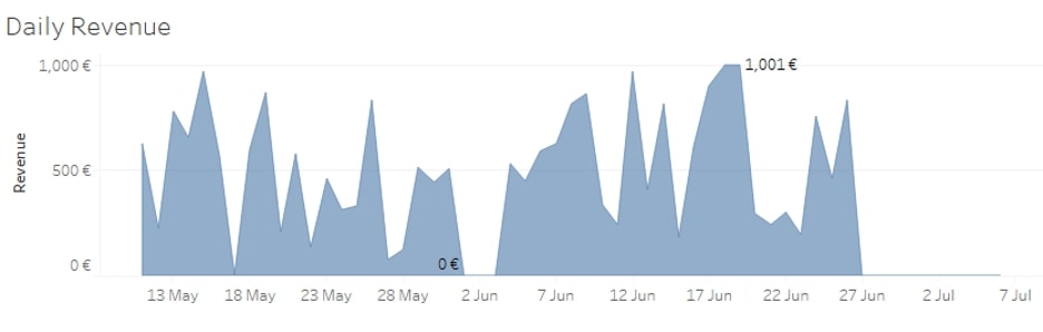
Let us consider the example below. In this chart, we have the daily revenue for an imaginary shop:
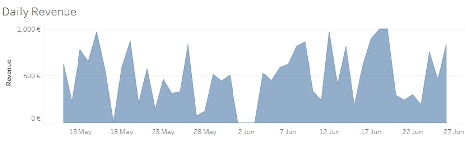
If we try to show the labels on this chart, it will become too crowded, especially if we allow labels to overlap other marks:
 Show Only the Last N labels
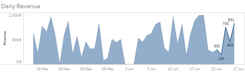
It may be the case that your audience is mostly interested to see the exact values for the last five days. Then we can hide all other labels to make the graph visually lighter and highlight the most important values at the same time. To do this, we would use table calculations such as LAST() and FIRST(). For more information, please see the blog about table calculations from my colleague Tom.
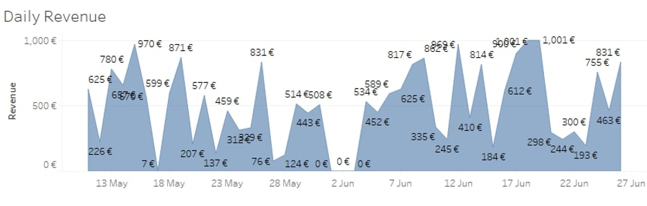
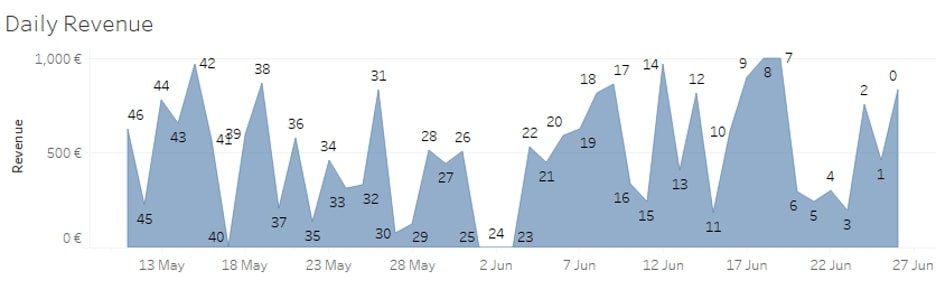
If we drop the LAST() function on the Labels card [calculated Table (across)], we can see what the position is of each date in reference to the last date:
We can easily use this to display only the last five labels by creating the following calculated field and dropping it to Labels on the Marks card:
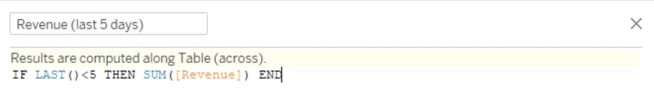
IF LAST()<5 THEN SUM([Revenue]) END
We can also use this new calculation on a dual axis to highlight the relevant values even more, like in the picture below. But this is a separate topic, so feel free to skip to the Show Only the First N Labels section.
To highlight the last five labels, drag and drop a copy of the newly calculated field to Rows to the right of SUM(Revenue). Right-click on it and select Dual Axis. Right-click on any of the axes and select Synchronize Axis. On the Marks card, select the shelf with the name of the newly calculated field. Change the chart type to Line, and remove all the pills from this shelf:
 Show Only the First N Labels
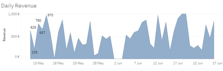
In a similar manner but using the FIRST() function, we can show the labels only for the first five date points:
IF FIRST()>-5 THEN SUM([Revenue]) END
 Show Only One MIN/MAX Label
My favourite use case is when you want to only show the minimum and maximum values in your chart, but your data contains more of them. This is especially annoying when you have many zeros (0) in your data, like in the chart below, and Tableau shows all of them by default:
To solve this one, we need a slightly more complex, two-step approach. But don’t worry; it’s still easy to do!
Step 1: First, we need to locate the date that has the minimum value on the chart. For this, we need to create the following calculated field:
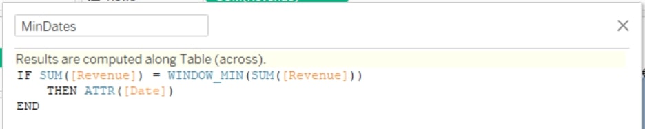
IF SUM([Revenue]) = WINDOW_MIN(SUM([Revenue]))
THEN ATTR([Date])
END
This calculation identifies at what date(s) in the chart we have the min value.
Step 2: Next, choose only one of the identified dates. To do so, you can use the following calculated field:
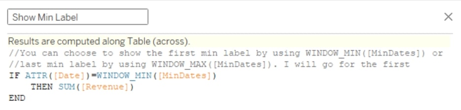
//You can choose to show the first min label by using WINDOW_MIN([MinDates]) or
//last min label by using WINDOW_MAX([MinDates]). I will go for the first
IF ATTR([Date])=WINDOW_MIN([MinDates])
THEN SUM([Revenue])
END
Drag the new calculated field to Labels and voila—now you have only one min label. In a similar manner, you can show only one max label by using WINDOW_MAX() in step 1.
To show both, i.e. only one min and one max label, you simply have to combine them into one calculation like so:
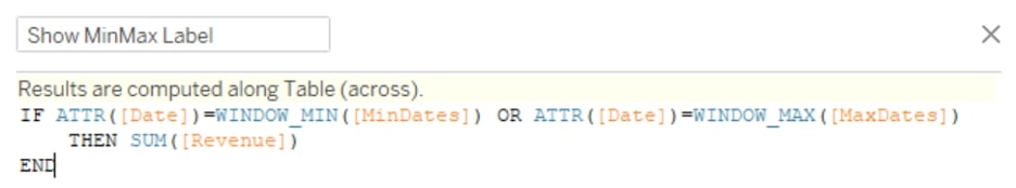
IF ATTR([Date])=WINDOW_MIN([MinDates]) OR ATTR([Date])=WINDOW_MAX([MaxDates])
THEN SUM([Revenue])
END
And here is the result:
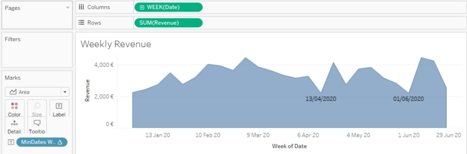
Please bear in mind that in all your calculations, you have to use the aggregation method you have in your view for the date and the numeric measure. In all the examples above, the chart shows the revenue at the daily level, so using ATTR([Date]) works fine because it is also at a daily level in the data. However, if we had the data aggregated at the weekly level, like in the example below, we would need to use MIN(DATETRUNC(‘week’, [Date])). The MIN is in there just because Tableau does not allow mixing aggregated and non-aggregated fields:
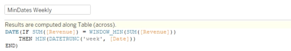
DATE(IF SUM([Revenue]) = WINDOW_MIN(SUM([Revenue]))
THEN MIN(DATETRUNC('week', [Date]))
END)
Show Only Top/Bottom N Labels
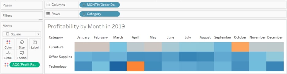
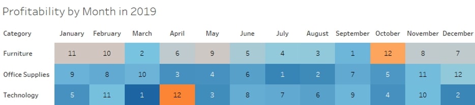
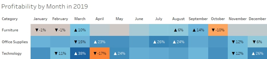
For this example, I am using the Superstore dataset. In the chart below, you can see a highlight table showing the profitability of each product category for every month in 2019:
What if we would like to show the labels only for the top and bottom three months in profitability for each category? For this example, we also have a two-step approach.
Step 1: Firstly, we have to rank each month by profitability using the RANK() function. Note that we do not use any aggregation for [Profit Ratio] because it is already an aggregated field:
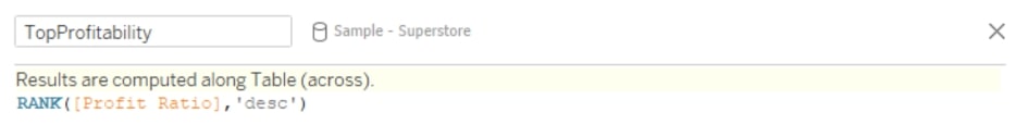
RANK([Profit Ratio],'desc')
If we drop this newly calculated field on Labels, we would have the rank shown as follows:
However, what we need to know is whether a certain month is within the top three. For that, we would change the calculation above to a Boolean, like so:
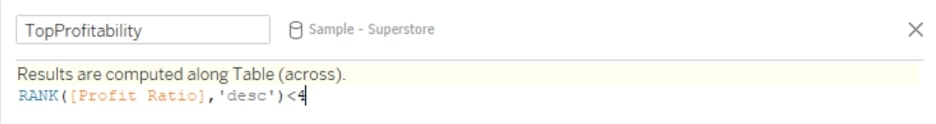
RANK([Profit Ratio],'desc')<4
For the bottom three months, we do the same calculation but rank the months ascending:
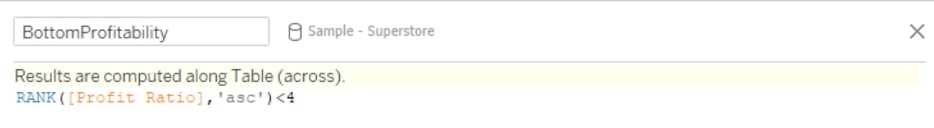
RANK([Profit Ratio],'asc')<4
Step 2: After creating the calculated fields for the the bottom and top three months, we can finally combine them in a condition that would show the labels only when they are within the top or bottom three:
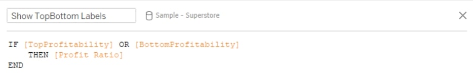
IF [TopProfitability] OR [BottomProfitability]
THEN [Profit Ratio]
END
When we drop this field to Labels, we see only the top/bottom three months like so:
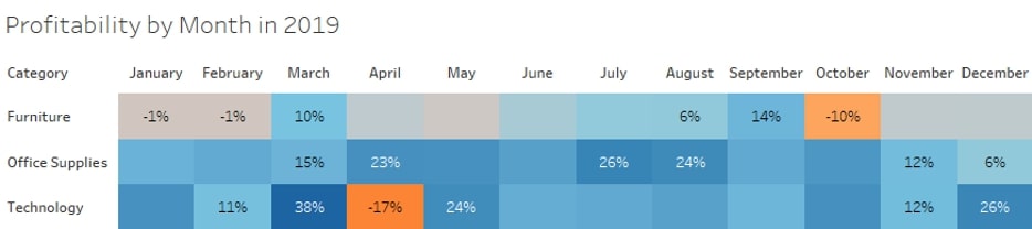
We achieved our goal, but it takes too much time to figure out which label is the bottom and which one is the top. We can leverage the calculations before and create an additional label to distinguish them more easily:
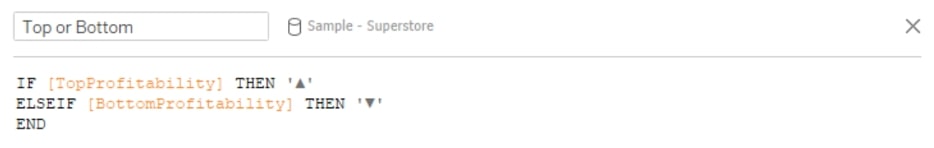
IF [TopProfitability] THEN '▲'
ELSEIF [BottomProfitability] THEN '▼'
END
Now, we can drag the new file to Labels and edit Labels as shown below:
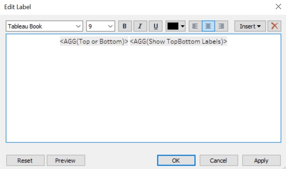
This gives us the following result:
There you have it! I hope this was helpful and laid out some valuable steps you can take to gain more control over your Tableau charts. Let us know if there is any way we can help. We’d love to support you.