
In this follow-up to my previous post on discovering the power of Tableau for financial reporting, we’ll be looking at how to create a waterfall chart. We’ll create the chart and include addition and subtraction using parts of a dimension. 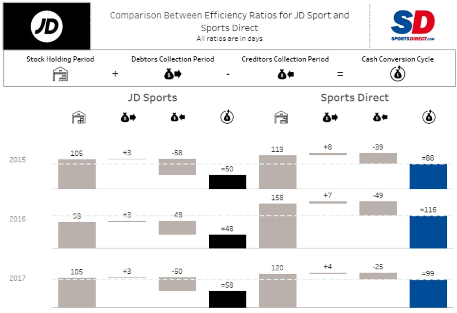
In this post, we are going to look at how I created the visuals I showed in my previous blog. I’ll also detail how to split out a waterfall by two further dimensions (year and company) and include some visual communication and dashboarding tips on how to bring it all together.
Firstly, there is a great post written by fellow InterWorker Ben Bausili about creating a waterfall chart that covers some very similar steps. My chart was a bit different as the amount I wanted to subtract appeared as a positive number in the data, so I created an alternative solution.
Step 0: Creating Aliases
This is a common part of data visualisation and you may or may not need to do this with your data. I had to do it with mine, though I could also have changed it at the data-source level. You create aliases by right-clicking the dimension field and selecting Aliases. I changed mine as below:
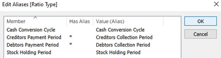
This is important to flag as you need to use the original name and not the alias in any calculated fields.
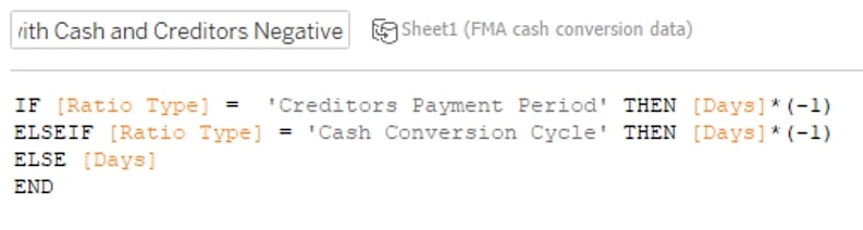
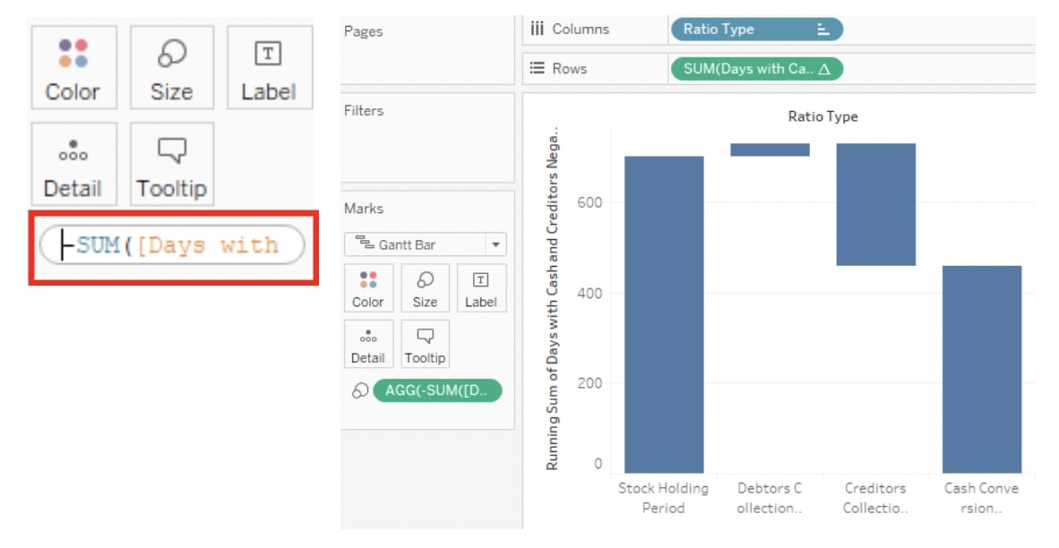
Step 1: Reversing the Negatives
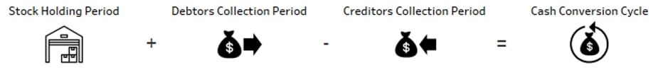
In my case, I wanted to show a well-known relationship in accounting: the number of days in the debtors, creditors, stock and cash cycle, specifically: stock + debtors – creditors = cash (total).
In order to do this, I used the formula:
Step 2: Create a Basic Gantt Chart
First, put the dimension on Columns and the measure on Rows. Next, apply the running total quick table calculation to the measure by right-clicking it. Then change the mark from automatic to Gantt on the Marks pane. It should look something like this:
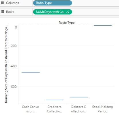
Note: We have nothing on size yet, so our Gantt marks are lines. Let’s take care of that.
Step 3: Create the Sort and Sizing
Change the sort manually by right-clicking the dimension and choosing manual sort to match the equation you want: stock + debtors – creditors = cash.
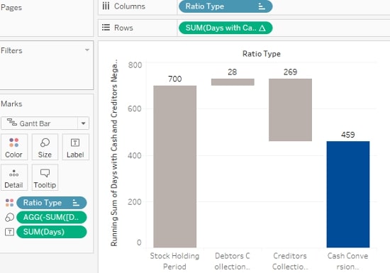
Once you’ve done that, drag your calculated field from the measures pane onto size, double-click it and type a – in front of it. This neat trick makes the Gantt marks look like bars by making them vertically bigger, dropping from the original Gantt mark because of the negative we typed in. It should look something like this:
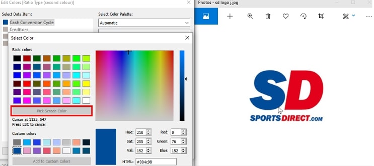
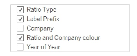
To do this, drag the dimension—ratio type—onto Colour. Next, edit the colours by double-clicking a colour in the colour legend. I set most of the bars to grey and used the Pick Screen Color option for my total by double-clicking the colour again in the Edit Colour dialog box:
Next, drag the original measure, which is Days, onto Label. Your result should look something like this:
Step 5: Communicating the Process to the Viewer
In Ben’s article, he used colour (red and green) and arrows to communicate his process. In my original article, I created a separate sheet to do this (see step 7e below). We could have also edited the labels by creating + , – and = to communicate the relationship to the viewer. Let me show you.
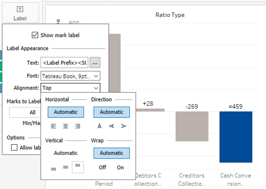
Begin by creating the calculated field. I used the formula below:
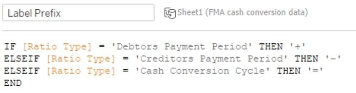
Next, drag the field onto Label and edit the label as below:
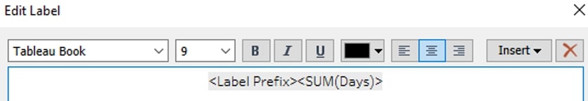
Then change the label alignment to Top:
Step 6: Splitting It out for Comparison
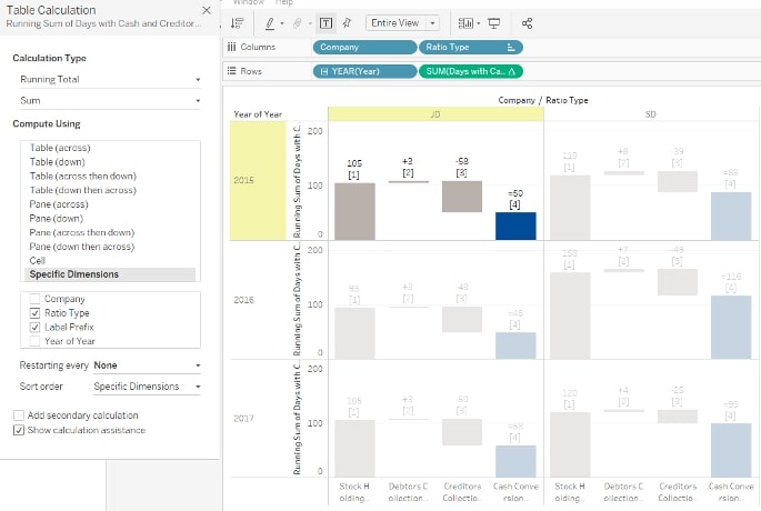
Put Company, or another comparative dimension, on Columns to the left of your original dimension, Ratio Type. Next, put discrete year on the left of your measure on Rows (in our case, it needs to be converted to a discrete date first). This will “break” our table calculation (convert it to one different to our logic). We can fix this the following way:
- Right-click on the measure on Rows and select Edit Table Calculation.
- Change Compute Using to Specific Dimensions.
- For each Company and Year (leave unticked), calculate my running sum across Ratio Type and Label (tick both).
It should look something like this:
Some Optional Tricks
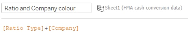
To get different colours for different companies, create a calculated field that combines the two relevant dimensions—Company and Ratio Type—and drag it onto Colour. Then edit the colours as before:
You will need to fix the table calc again like before since we added a new dimension:
Clean up the formatting by removing row and column dividers, grid lines on rows, hiding all headers except for year, but hiding field labels for year. You may then choose to create a reference line. To do this, create a calculated field that only records the value of your total category regardless of the company. Place it on Detail on the Marks card:
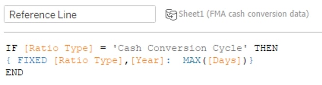 From the Analytics pane, drag in a reference line (per pane). Change the value to your calculated field and edit the formatting. You can also create a sheet with the instructions. To accomplish that, select relevant icons from a website like flaticon.com then download them to the Shapes folder in your Tableau repository (usually located in your Documents folder). Place your original dimension (Ratio) on Columns, change the Marks card to Shape, and edit the shapes to be the icons you downloaded. Finally, separate out the ratio types to give yourself some more room:
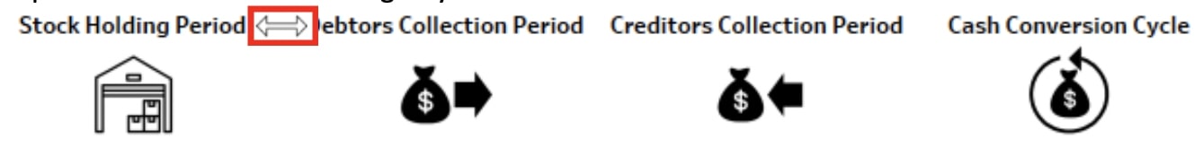
Annotate in the space between the icons with + , – , = , etc., as needed and format the annotations to remove the shading:
Create the Tableau Dashboard
When it comes to creating the dashboard in Tableau, you have (of course) several options, but these were the steps involved in my process:
- Duplicate your explanation sheet above twice, hide the headers and possibly delete the annotations. It’s all a matter of taste and preference. Hide the splitting dimension (Company) headers in the main worksheet and, instead, use text boxes to place headers above the duplicated icon sheets.
- Place images in the top left and right corners in a horizontal container with the title.
- Arrange the objects as below and use borders where appropriate.
You should end up with something similar to this:

Above: This dashboard was created with publicly available data.
Well done for making it to the end!
Put It into Practice
As with a lot of visual analytics, creating something that is functional can be quick, but to communicate effectively to your audience and make those visuals attractive takes a bit more time. Drop a line in the comments below about how your waterfall charts have turned out, and if you run into any other data or tech snags, remember InterWorks would love to help. Best of luck in your endeavours!