In my previous article, I explained how Kendra Allenspach and I used parameter actions to build an interactive story about InterWorks’ Spotify listening preferences. The counter technique I described is the underlying foundation of the story, but we also used Tableau’s new Viz Animations feature to add some visual interest.
An Unconventional Take on Viz Animations
As an initial disclaimer, I’ll say that our use of Viz Animations is untraditional. Although Tableau cites storytelling as a potential use for the feature, I believe the primary application of Viz Animations is to draw attention to changes in your dataset as you adjust filters. “As a pre-attentive visual property,” Tableau writes in their article introducing the new feature, “motion calls attention to what’s changed and de-emphasizes what hasn’t.” The Tableau community has already shared many great use cases for this feature (just search #VizAnimation on Twitter), particularly ones that incorporate the pages shelf to show changes over time.
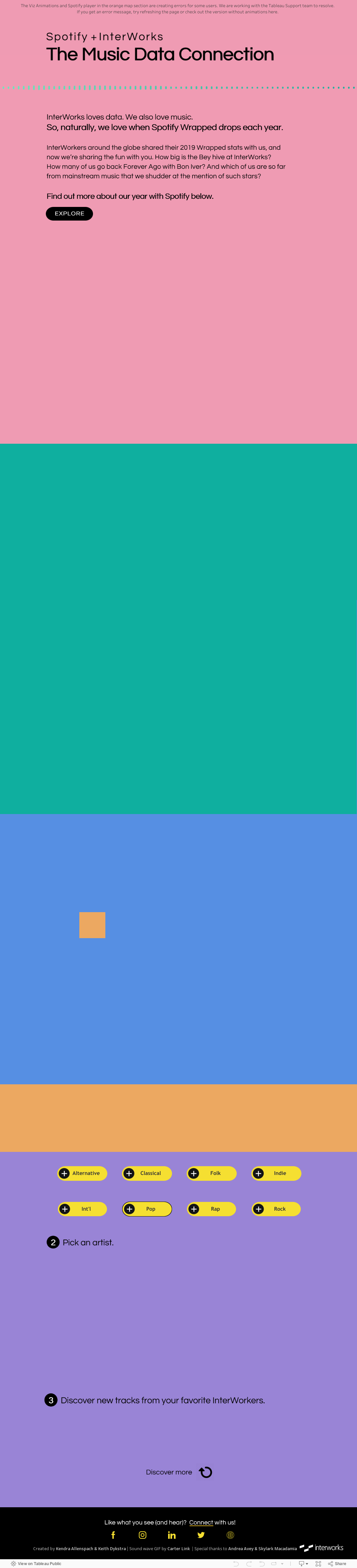
Our intention with this project was not to create a traditional tool for analysis, however. We wanted to use Tableau to tell an engaging story about the music we listened to in 2019, and Viz Animations helped us make that story a little more interesting. Here’s a quick preview of the final product before I dive into the details of what we did with animations:

In this article, I’ll focus on how we used animated transitions to gradually reveal different parts of our story, like this:

To be totally honest, I discovered this technique by accident. I was building a bar chart while I had the animations feature turned on. When I changed the scale of the axis and saw the bars shrink, a lightbulb went on:
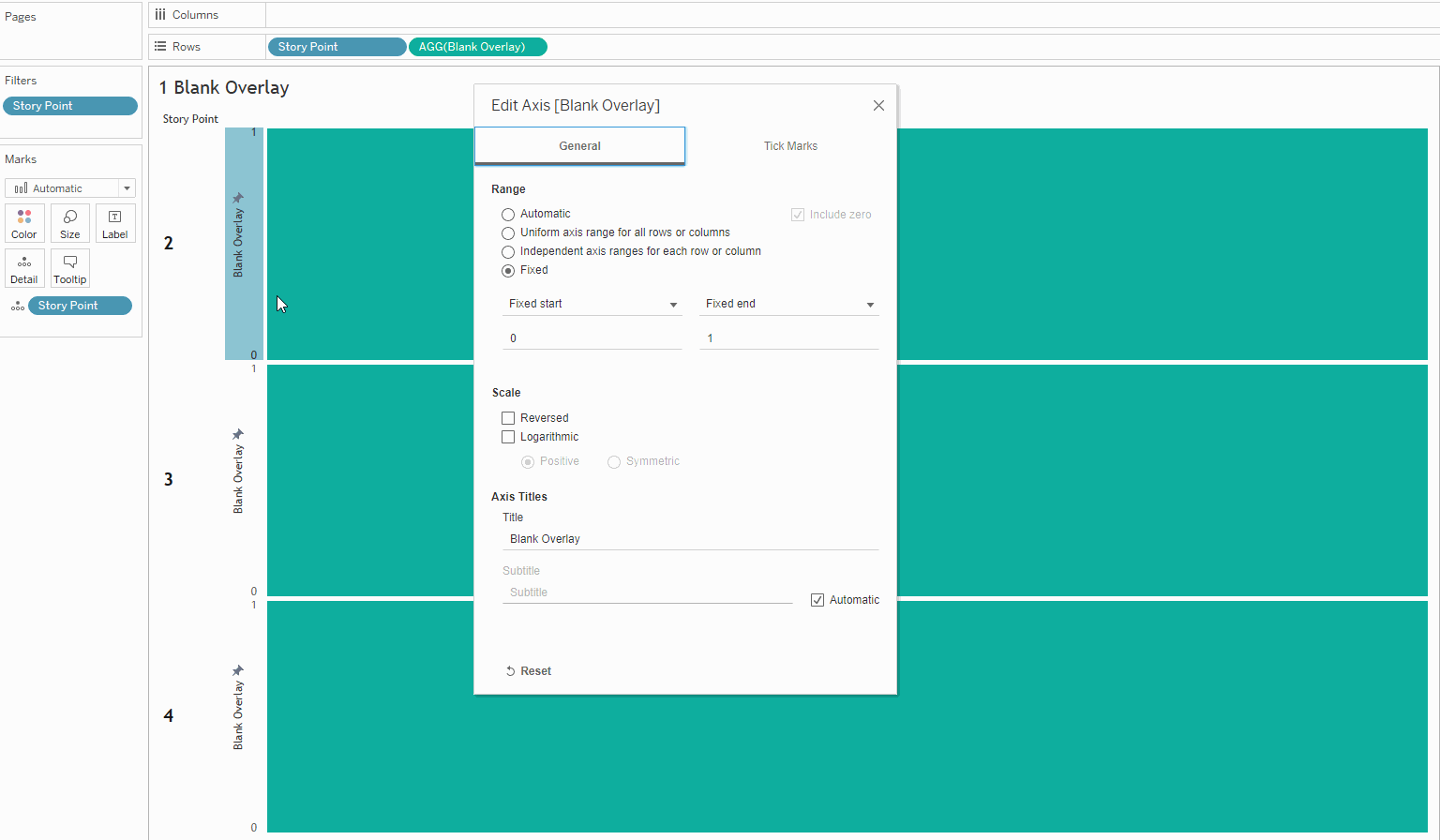
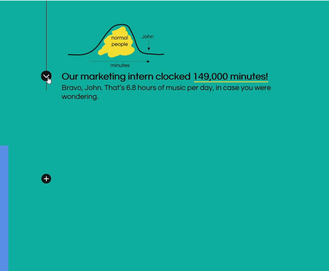
I realized I could use this intentionally to cover up certain sections of my story and gradually reveal them, which would allow me to control the way the narrative progressed throughout the story. As you can see below, the images and text are technically displayed on the dashboard from the start, but they are covered up initially by a bar chart that gradually disappears. (I’ve outlined and adjusted the width of the bar chart sheet to make it more obvious how everything works together.)

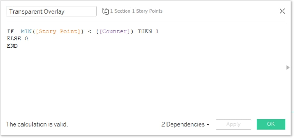
In order to make bar charts that swipe down and gradually reveal the contents underneath, I used a pretty basic formula:
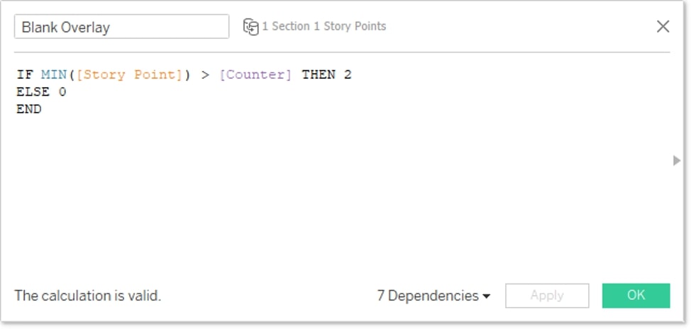
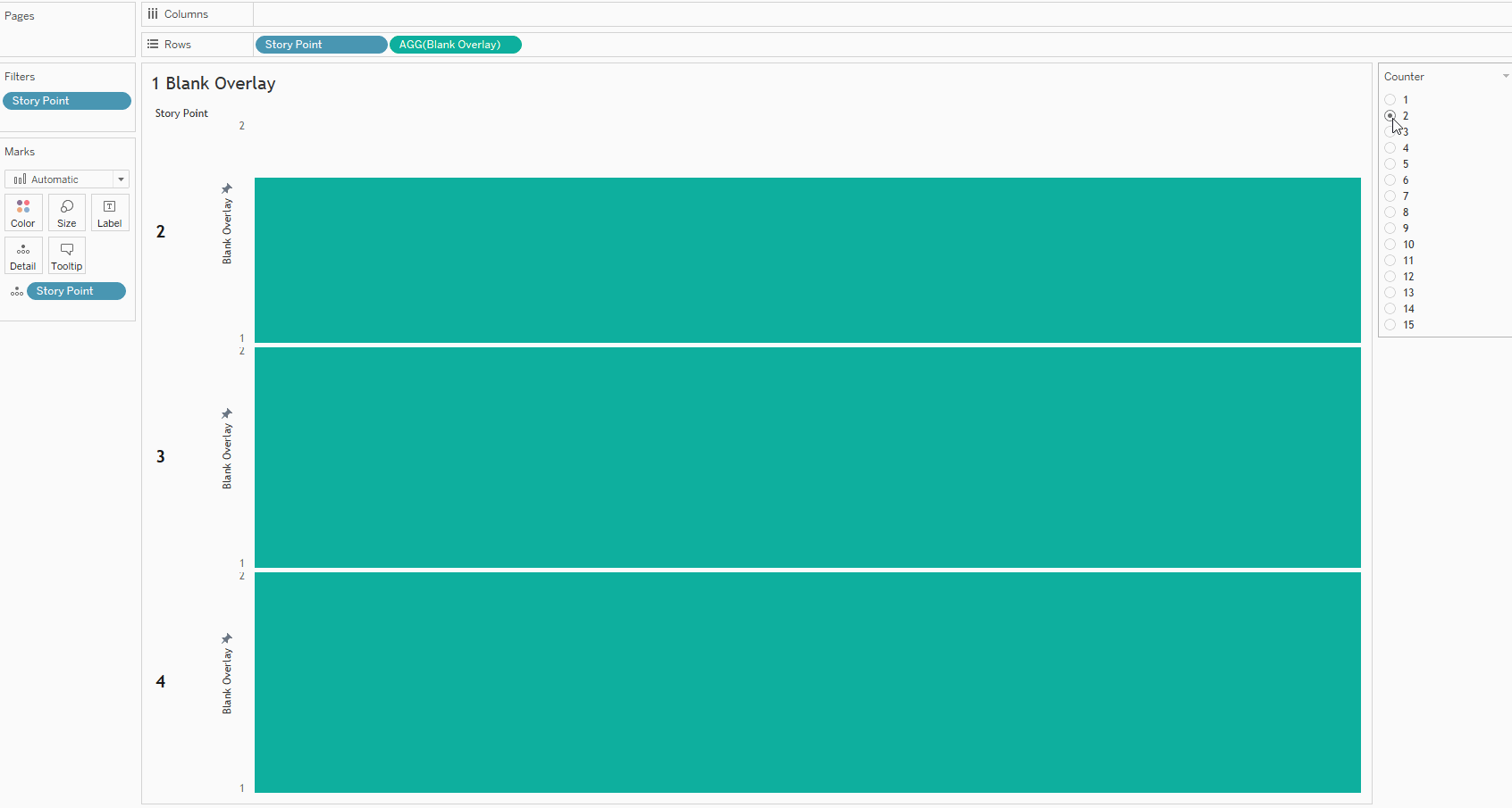
If you read my previous article, this formula will probably look familiar. (If you haven’t read the article, you may want to go back and skim it to understand how the Counter parameter works.) The basic idea is that this field will draw a bar chart with a length of 2 units when the story point is greater than the counter. That bar will disappear (change to a length of 0) if the story point is less than the counter. (Note: I intentionally chose ELSE 0 instead of ELSE NULL because the animated transition from 2 to NULL was more abrupt than the transition from 2 to 0.) By fixing the axis to start at 1 and end at 2, we effectively get this:
And Now for a Disappearing Trick …
By making the background of this sheet transparent, turning off row dividers and any extra lines, and matching the color of the bars to the background of the dashboard, we effectively get a set of rectangles that we can use to hide other elements if we float the sheet on top of those elements.
I added a second sheet with the color set to 50% opacity to fade the previous point as you progress to the next one. By reversing the axis, the bars swipe downwards instead of upwards, covering the point above as the new one is revealed:
![]()
The formula on this sheet just uses a less than ( < ) operator instead of a greater than ( > ) operator:
We used similar sheets throughout the dashboard to reveal other sections, varying the setup to swipe horizontally instead of vertically in some places:
If you use this technique, be careful about the order of your floating sheets. This became one of the biggest challenges of the project because we had a LOT of sheets and sometimes multiple layers on top of each other. But you can make your life a lot easier by using the item hierarchy to rename and rearrange your elements:
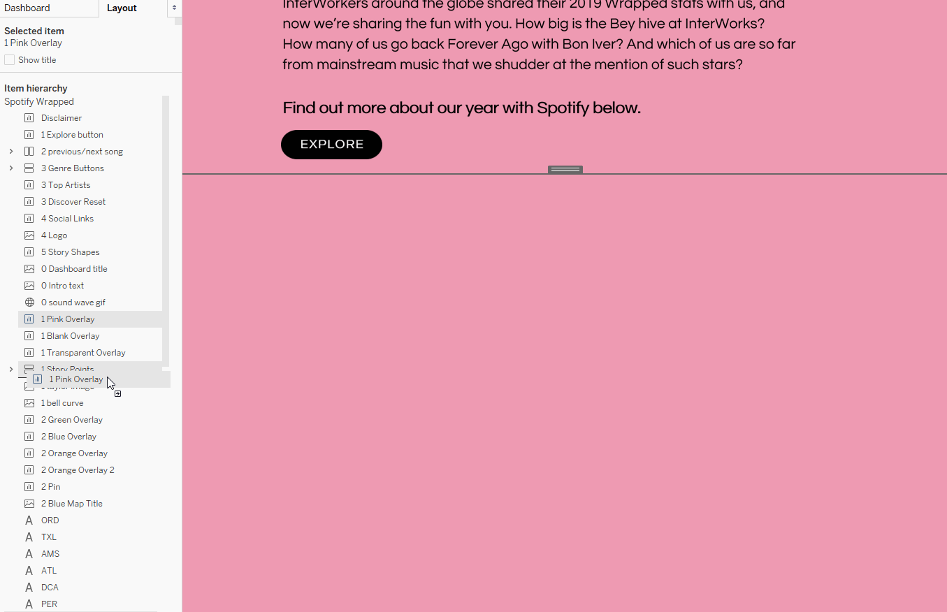
The order of the list reflects your floating order. So dragging an item up in the hierarchy list moves it up in the floating order (on top of elements below it in the list). And vice versa: dragging an item down in the hierarchy moves it down in the floating order (underneath elements above it in the list).
Now that you know all the secrets to this project, check out the full, interactive version: