Building a compelling visualization with Tableau is all about telling a “story.” Within your data, there is a story. That may sound strange to new Tableau users or to data analysts in general, but that’s the best way to describe what it means to “guide” your report consumers to the most critical and important insights in your dashboard.
That’s the story.
You can guide that story beyond just the visualization. Little things like mark labels and axis labels help build context. That’s why the dashboard Title, Caption and Summary can also be essential parts of your story that point your audience in the right direction.
O Caption! My Caption!
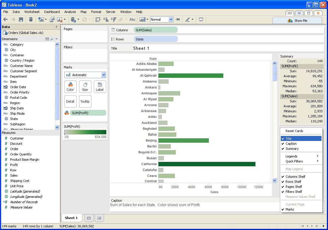
Worksheet Title, Caption and Summary can be accessed by right-clicking on the Workbook Canvas.

Figure 1: Title, Caption and Summary.
In Figure 1 above, you can see in the right-click menu that Title, Caption and Summary all have a checkmark next to them. Each has been selected and are displayed on the canvas area:
- Title is displayed just beneath the Rows and Columns shelves at the top of the workbook.
- Caption is displayed just beneath the workbook, but above the workbook tabs. You can drag and drop this area to appear wherever you’d like on the canvas.
- Summary automatically appears on the right-hand side of the canvas, but can be dragged to fit in around the other shelves.
The Title of the workbook is a succinct way to introduce your visualization, such as “Q4 Earnings Report” or “Profit by Product Category.” By default, the title will be what you have named the worksheet tab. You can double-click in the Title area to rename as needed. You may choose to insert fields into the Title so that it will update and change based on filter/parameter selections in the view.
The Caption is a more in-depth way to describe your visualization and could even be used to point out a particular aspect of importance. Tableau will automatically create the verbiage for you, describing which dimensions and measures were used to create the above table. You can edit your Caption with a double-click, which also allows basic style formatting.
Finally, your Summary card presents a statistical breakdown of every measure you included in your table, including measures that you used on your Marks card. For instance, if you colored your marks by the Profit measure, then the Summary card will also summarize more profit.
Extra Features
There are two more little bits to consider:
Presentation Mode
Title, Caption and Summary will also appear in Presentation Mode. You can use Presentation Mode as a quick way to show your table or visualization without publishing it. Title, Caption and Summary are great additions to give it a final level of polish.
Formatting
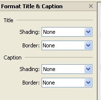
You can format the Title and Caption area by right-clicking on either area in your Workbook Canvas and selecting Format Title … or Format Caption …
Not to be confused with the text formatting options you have under the Edit option, Format allows you to stylize the area of the Title or the Caption. Clicking on that option will bring up a new set of options in your Sidebar.

Figure 2: Format options.
You can play around with these options to see exactly how they will change the look and feel of your Title and Caption area. Remember: If you don’t like it, use the Undo button in the Toolbar to wipe away any mistakes.
Conclusion
The strength of Tableau is about how you tell your story. You’ve got a lot of tools and tricks at your disposal to help in that task. Considering using your Title, Caption and Summary to get your report consumers engaged quickly.
Want to learn more about Tableau? Here are the other Tableau Essentials posts we have so far:
- The Toolbar (Interface)
- The Sidebar (Interface)
- The Worksheet Canvas (Interface)
- Measures & Default Properties
- Connect to Data
- The Status Bar
More articles are coming soon, so check back regularly.
As always, let us know if you have any questions or comments about this post or Tableau in general. If you’re looking for personalized training or help with something bigger, contact us directly!

