Getting started in the Power BI Desktop application is a fun and exciting time. There are so many components that make up this masterful business intelligence tool, that at first glance it can appear a bit overwhelming.
Not to fret.
The good news is if you are familiar with Microsoft Excel and/or Microsoft PowerPoint already, then most of the actual point and clicking will be done in a very similar and intuitive way.
Step 1: Download Power BI Desktop
You can do this for free through the Microsoft App Store, or you can download an executable file directly from the Microsoft Download Center using keyword “Power BI Desktop.”
It’s important to note a few things. First, make sure you’ve got the system requirements that it takes to download and operate Power BI Desktop. Upon a glance, the program takes up roughly 500 MB of local storage space on your machine.
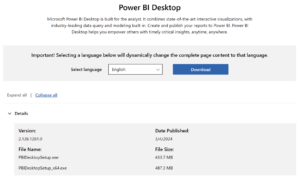
And sorry Mac users, Power BI Desktop is equipped and supported only on Windows-based operating systems. There are ways around that, but let’s keep things as simple as possible for those of us who are new to the system.
Step 2: Connect to Your Data
After you’ve finished installation and opened Power BI Desktop, the first thing you’ll want to do is connect to some data. You’ll need to know where your data lives, whether on a server, or in the cloud ,or housed locally on your computer if you want to create reports. There are hundreds of native data connector types and even sample datasets that are available, so it should be pretty painless to get data loaded into Power BI Desktop. Click the “Get Data” button from the Home ribbon to get started (File > Get data will also get you there):
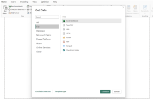
As an enablement consultant, I usually make use of Excel and CSV files to build reports in Power BI for my trainings, but explore the list provided and relish on all of the options available to you.
The great part about the report building process is there’s never a chance of overwriting your data once it gets into Power BI Desktop. That means you’re in a safe place to try new things and to do lots of iterating and exploratory analysis without harming any of your original data inside of the tool.
Now that you’ve connected to your data, let’s move on to the next step.
Step 3: Clean, Shape and Transform Your Data
Power BI Desktop relies on tidy data – datasets that provide a standardized way to link the structure of a dataset with its meaning – most often made up of rows and columns within the framework of tables. It is said that data is never in a perfectly clean state to visualize when you first connect, so you’ll need a way to shape it from time to time. Using the built-in Query Editor, you can natively do ETL (extract, transform and load) before data gets loaded into Power BI Desktop so that it suits your needs.

The Power Query Editor is a separate workspace that enables ETL processes within a user-friendly interface. You’ll select tables from the navigator window shown above, where you’ll have the option to either “load” data into a new report immediately or to “transform” it first using the option indicated above. Upon selecting Transform data, you’ll be taken directly into Query Editor. It’s refreshing to have this ETL capability as a part of your workflow after connecting to a data source.
Notice extensive “no-code” controls to clean, filter, append, transpose, pivot, remove rows, get rid of blanks, merge/append tables, promote rows to headers, etc. Alternatively, you can use “low-code” queries via the M language to write out formulas that create and manage tables, populate values and build columns.
What is M? The Power Query M formula language is a mashup language designed for Excel and Power BI that creates queries in order to mix data together (for a tour, go here). Whereas inside of the actual Power BI Desktop application, that interface is operated on the underlining language of DAX (Data Analysis Expressions) in order to process calculations and perform query analysis.
In the example below, you can see icons in the menu ribbon that help quickly transform data. You can see all of the changes tracked in the applied steps pane to the right. This displays all of your transformations chronologically, offering a way to document, make further edits and/or roll-back as needed. The most recently applied step from this example shows the Order ID field was changed to a text data type to ensure Power BI doesn’t recognize that data as a number to aggregate. The formula bar exposes the code used to accomplish this change in M.
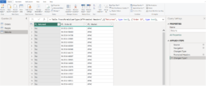
Query Editor Tip: the “View” tab in Query Editor has options for “column quality, distribution and profile” that help make sense of and validate the amount of, count of, errors with, and the distinctness and uniqueness of the data you’re working with.
Once finished with changes, it’s time to hit the “Close & Apply” button to push the updates from the Query Editor to Power BI and activate your datasets. This might take a bit of time to load depending on the size of your tables.
Step 4: Build Your Report
As you can probably guess, different combinations of fields and chart types create the visuals you end up with on your report canvas. To create most charts, you can simply select the chart type you desire from the ribbon and then select combinations of fields from the tables that exist in the data pane.
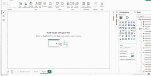
You can adjust which fields own the X and Y axis easily. Plus, you can control the fields that should be used for your legends and slicers, and easily toggle on/off titles, values, gridlines, labels and more. The format and filter panes are accessible using the expand/collapse icons to further change the look of the view or to limit the data being shown in some way.
Remember to name your report pages at the bottom, which display with a generic page number until you do. You can also add a text box from the ribbon to generate a title for your sheet, which should include a summary of what the user is expected to see along with instructions provided somewhere on how to interact, drill-down and filter. Your first report page could be a summary or overview, while additional pages for the report might offer up more detail on demand for users.
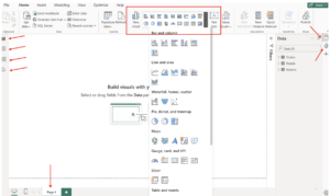
The blank report page shown above highlights some of the important components of the canvas. You may toggle from the report view to the data/table or model views along the left side, should you want to see your data as a crosstab or dive into how your tables are related semantically (and possibly make changes). Also notice the option for a Desktop versus Mobile layout at the bottom left of the page in case you need to tailor the display differently for on-the-go users.
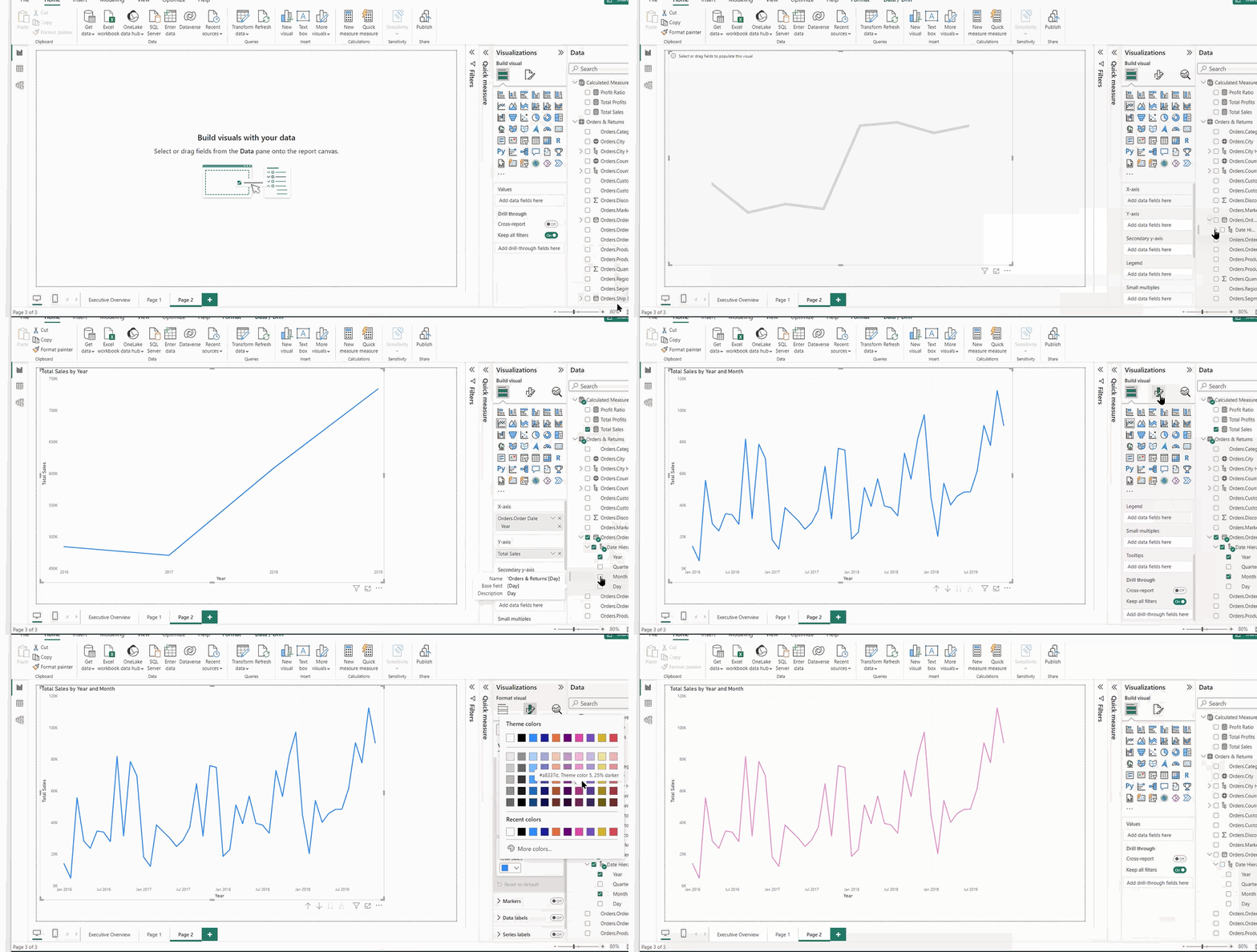
Once a chart makes its way onto the canvas, you can drag it around, resize it and change its color.
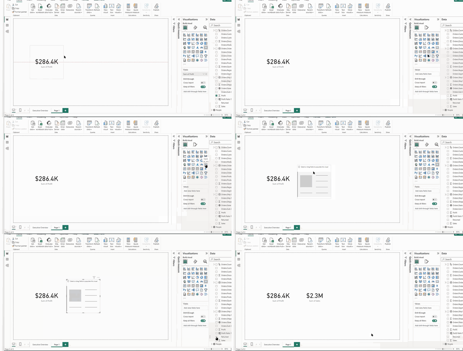
As more charts are displayed on a report page, make sure you’ve got some transition space between the objects so they don’t run together.
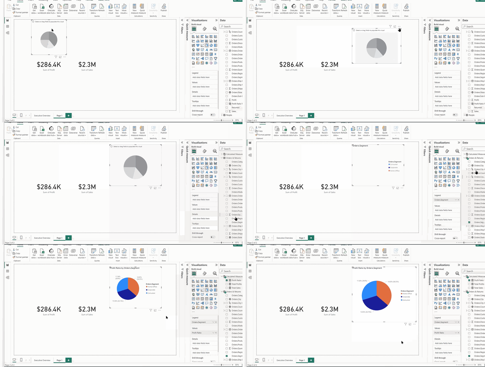
Be cautious with the total number of charts on a page. It’s best practice to keep the visual widget count low to ensure report performance remains optimum. It also keeps the analysis from being cluttered. Try three to five total visuals as an approach to start.
After getting everything in place, you can test your report’s interaction by clicking on your marks (the squares, slices, bars, colors or headers) to see any active cross-filtering or cross-highlighting. And, if you want to provide on-screen filters for users to further segment and limit the data in the view, you’ll utilize slicers on your report, which are one of the chart options available from the list.
For each chart in a report, there’s information that displays upon hovering, which exposes the meaning of a specific mark from that view, AKA the tooltip. Additionally, new report pages can be used as embedded tooltips to bring more insights into your visualizations. Offering additional visual analysis in a tooltip experience can make reports more efficient and save time.
There is certainly not a single right or wrong way to develop a report based on your own preferences, analysis requirements, end-user needs or specific tasks required of you.
Report Tips: By default, Power BI Desktop will aggregate your values, using a sum function denoted with a Sigma sign next to the metric name. There is a column tools ribbon that allows for further control of number formatting, such as to a currency or specific number of decimals.

Step 5: Share and Collaborate
It’s time to get the word out that your report is done. If you have already saved your report as a local file on your machine, that’s a fine backup. But you will use the Publish button at the top of your report to get it into the Power BI Service environment (or Fabric, if your organization uses that to share reports). A pro/premium license is needed to take advantage of many of the sharing, collaboration and security “service” features for your published reports.
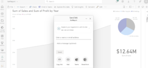
If your company has the appropriate paid tier, you and others will be able to comment, share, bookmark, download, export, embed into Teams or set up data-driven alerts based on targets, thresholds or other value-defined constants. The share option lets you “add recipients” from your organization or provides you a link that you can share in an email or messaging app directly.
However you go about it, congratulations on creating your first report. There’s a lot more to come in my follow-on posts about further designing, filtering, formatting and using calculated columns, measures and DAX. Stay tuned!
