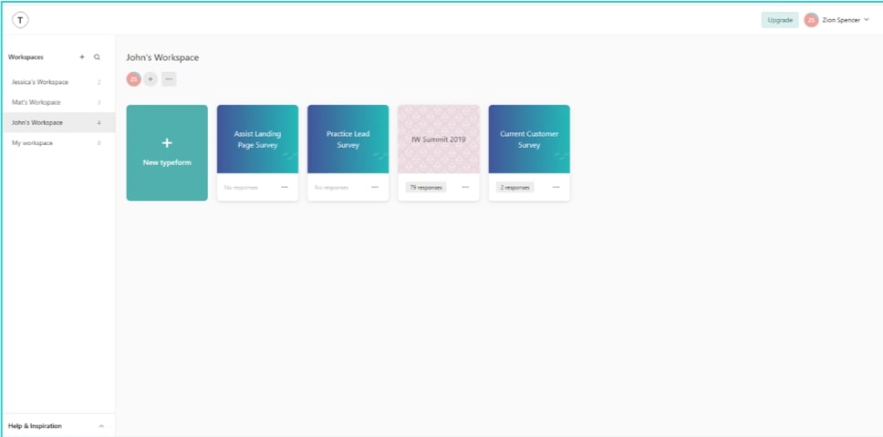
If you’ve never heard of Typeform, don’t worry. A lot of people haven’t. However, allow me to introduce you. Typeform is a great tool that can stand in place of programs like SurveyMonkey or Qualtrics. As users take a survey, it can provide an awesome experience, which—let’s face it—can be tough to deliver at times.
As a marketing analytics intern here at InterWorks, I’ve had the awesome opportunity to expand upon the skills I’ve developed as a photographer, website builder and marketing student. I am in my third year at Oklahoma State University, and while the world of marketing is not new to me, the prospect of Typeform is something that really got me excited. It blends many of my skills and interests, and seeing a final product that is visually pleasing yet simple is something I’ve always enjoyed.
Why Do Companies Send Surveys?
When it comes to the world of survey taking, there’s always a certain level of pressure on the survey writer to make sure they communicate the least oppressive version of the questions they need to ask. This can be a delicate balance, and if it ends up not landing well, it can leave a bad impression with your client. Despite knowing that customers don’t like surveys, businesses (including InterWorks) continue to ask them why they give their business to the organizations they do. This is because it’s necessary to know how we are doing.
With all of our products and services, we are always trying to improve and provide the best experience to the client. One of the main ways we do this is by asking people what they want out of an offering. This sounds simple, but think about a time when you didn’t like the way a product or service performed. Did you complain? Did the company ask you about it? Did they respond to your complaint and try to fix it? It takes effort for a company to self-assess and improve, but it requires feedback to act upon first.

Above: A look at the builder interface in Typeform
How is Typeform Different?
Typeform is a form and survey builder. The end result is the same as other similar software in that, by the time you send out a survey and someone takes it, you have data. However, the difference in Typeform, especially when compared to other comparable products, is that the user interface (UI) and the journey to the data is better. This is true for both the builder and the survey taker. Simply put, Typeform is just easier. From a user standpoint, the appearance is more engaging and seamless than other programs that I’ve had experience with.
I get excited at the prospect of people taking a survey I made in Typeform. There have been times when, after someone has taken a Typeform survey, they comment on how satisfying it is to send their data via the interface. When’s the last time you had someone tell you they enjoyed taking a survey? This speaks volumes for the software’s ability to make your questions engaging, as well as effective.
Quantitative or Qualitative or Both?
Different kinds of data call for different kinds of questions, and free-form answers and qualitative data can play a large role in how our surveys affect our companies and our teams. It may seem less exciting when you receive a free-form answer since you can’t manipulate it in your favorite visualization software, but with a little bit of data clean-up, those answers can become powerful insights.
The hardest part of the free-form answer is actually getting the customer to write it. One of the ways Typeform can help is that it draws your customer in. Typeform allows you to blend quantitative and qualitative data to get the most out of each survey you send. It’s almost as if, when you build a survey in Typeform, you’re telling clients that you value their time and effort that much more.

Above: The initial screen when beginning a Typeform survey
What’s the Verdict?
Should you send your customers a survey? I can assure you that the answer is a resounding, yes! The important part of creating a meaningful survey experience is making sure there is mutual value in the insights that come from it. Asking customers what they think is a great way to show you care. However, no matter how sleek and streamlined your UI is, if you’re relentless in notifying clients of every little thing your company is doing, it can still wear them out.
In the end, the balance depends on two things: timing and content.
These two things will help you make a decision about what is necessary in a survey. Before you send your next survey out, ask yourself: “Is this the best (or at least a good) time to send this?” and “Did I make the most efficient and effective use of space as possible?”. This will ensure the biggest bang for your buck. In the end, this will leave your customers feeling like they helped you, rather than merely checked something off their to-do list. When you are ready to start building your next survey, I highly encourage you to check out Typeform.

