It should come as no surprise that data is not always as it seems. Well, maybe not that big of a surprise to the data analysts out there. After all, most of us are swimming in data. And it might not have had time to be ‘treated’ before it’s consumed. In our ‘always on’ world, who wants to wait? Sometimes, it’s good to have a bag of tricks. Good tricks, mind you.
So, open the workbook and snoop around.
You’ll notice if you downloaded the workbook that our desired date field (labeled ‘Time’) is an int data type with members such as ‘20061’,’20062’, etc. The catch is the last digit is a quarter and not a month. We want a smooth line chart. Can we do that? Oh yes.
So, here’s what happens:
1.) Covert the ‘Time’ field into a date field by splitting, adding and then converting.
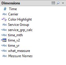
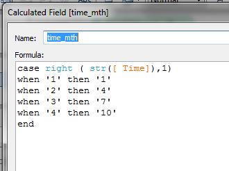
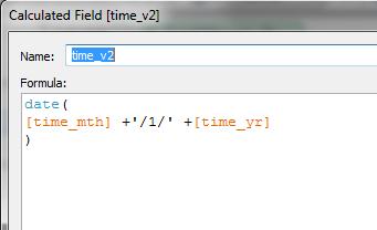
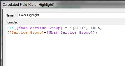
2.) Use a parameter to see the forest and the trees. You’ll need to make the color change only when your selection is true. Sure, you can do this with brushing but you risk putting too much junk on the dashboard. In the end, we want to do it with a parameter (which also will change others views in your dashboard).
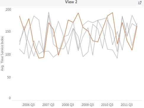
And, finally, the big picture. Your dashboard should be greater than the sum of its parts. You don’t want each view to compete with each other; rather, you want them to all be seen as one, seamless, view.
