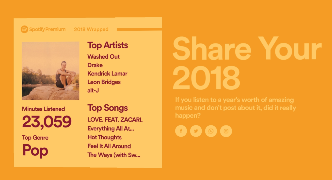
If you’re subscribed to a music-streaming service, chances are high that you use Spotify. And if you use Spotify, you probably received a Spotify Wrapped summary of your listening habits for 2018.
This summary really consists of two parts: a visual slideshow that gives you a thorough retrospective of your year in music, including everything from the oldest song you streamed to the very first song that christened your 2018. At the end of this interactive journey, Spotify provides you with a snapshot of the big takeaways and generates a playlist for you, Your Top Songs 2018.

Above: the final screen of my Spotify Wrapped summary
The Best Work Is Fueled by the Best Music
At InterWorks, we’re fueled by a lot of things, but three of our most significant drivers are likely music, coffee and data (of course). We decided putting together a data viz that drew from our employees’ Spotify Wrapped information would be a fun way to marry two of those three things (don’t worry, there’s already a coffee-forward blog up!).
The InterWorkers that wanted to participate provided their final screenshot and the link to their Top Songs 2018 playlist. Next, one of our amazing data masters, David Pires, compiled the data into a rad viz that shows where these team members are located geographically, our average listening time and our top genres, among other data nuggets.
Spotify Wrapped: InterWorks
Check out David’s viz and see who listened to the most music, who’s got the best playlists and what a music festival based solely on InterWorks’ Spotify activity would look like.
Hint: it’s a once-in-a-lifetime event because you will never see these headliners together IRL.
