Adding Reference lines for specific targets or target areas can be very beneficial to seeing the overall picture of the health of your organization. Adding reference lines, bands or distributions to your views helps emphasize valuable areas that may be useful in interpreting your data. Specifically, when comparing multiple groups or categories of data, reference lines and bands provide immediate feedback on the overall differences between the groups.
The steps below will show how to add a reference line, a reference band, and a reference distribution in Tableau:
Open Tableau and Connect to the Sample – Superstore Sales (Excel)
Drag the Profit Ratio to the Column Shelf and the Customer Segment the row shelf. Select Bar in the Marks Shelf and you should see the graph below:

- A. To Add a Reference Line
- Right Click on the Profit Ration Axis and select Add Reference Line
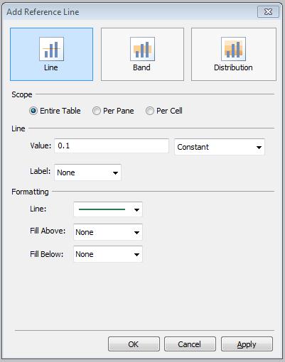
- Your Add Reference Dialog will appear.
- The first option to decide on your dialog is Scope. Do you want Entire Table, Per Pane , Per Cell. For more information on Scope see post for Understanding Scope when Adding Reference Lines in Tableau. For this example we will use Per Pane as we only have one pane/table in this example.
- For the Reference Line Option: Here you can select to use Avg, Constant, Max, Median, Etc. For the Value, Type in the desired value for constant, or select the field you want to query on.
- Label can be left blank by selecting None, or Use the label of your choice from the drop down to have it appear in your view.
- Formatting is also up to you. You can select solid or dotted lines and your choice of color.
- You can also tell Tableau to Fill Above or below.
- The options I have chosen are illustrated in the picture below.

Your View would then look like this. I now have a Reference Line at 10% for my axis Profit Ratio.

- A. To Add a Reference Band
- Right click and duplicate the sheet you are working on.
- You can remove the reference line you just created by right clicking the Profit Ratio Axis and selecting Remove Reference Line.
- I will not be removing the line, because I will add a band to enhance the line. The band I will add will be from 9% to 10% with 10 being the target shown by the reference line before.
- To add the band right click on the Profit ration axis and select Add Reference line.
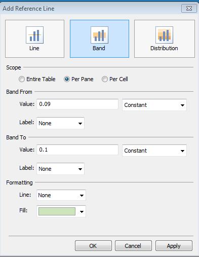
- Click the Band option at the top of the dialog.
- All option for Reference Band are now available to you. The selections I have made are shown below.
- You will select Band From and Band To.

You will then have a Band from 9% to 10% on your view with the 10% Target Line we have already created. See below:

- A. To Add a Reference Distribution
- Right Click on the Profit Ratio Axis and Remove the two Reference lines that you have created.
- Right Click again and select Add Reference Line
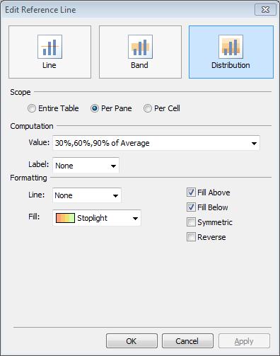
- Select Distribution at the top
- Select your computation options (i.e. Confidence Interval, Percentiles, Percentages, etc.)
- Select your field to compute the computation on. Here we are using AGG(Profit Ratio) with Percentages of 30, 60, and 90.
- Select your color options. You can fill above and below, Symmetric or Reverse. You can then select colors for the fill based on your options.

You then will have added a Reference Distribution to you view.


