
There are several new Drupal theme toolboxes available that now allow easy-to-setup responsive and adaptive layouts.
As of this publishing, Omega allows the most power for a newcomer to Drupal and theming without adding additional front-end styling that comes with a contributed theme or template. The Omega UI allows a developer to easily customize the site layout and template without having to actually create and code a custom template.
The Omega documentation on Drupal (http://drupal.org/node/819164) is extensive and informative. In this article, I’ll attempt to make it even easier for a beginner to quickly set up a responsive theme with Omega.
This lesson will focus on the very basics of the Omega UI and creating an Omega sub-theme.
Modules and theme used in this walk-through:
Omega (http://drupal.org/project/omega)
Omega tools (http://drupal.org/project/omega_tools)
Preparations:
- You have Drupal installed and running, right?
- Download and enable the Omega tools module.
- Download and do not enable the Omega theme.
Creating an Omega Subtheme
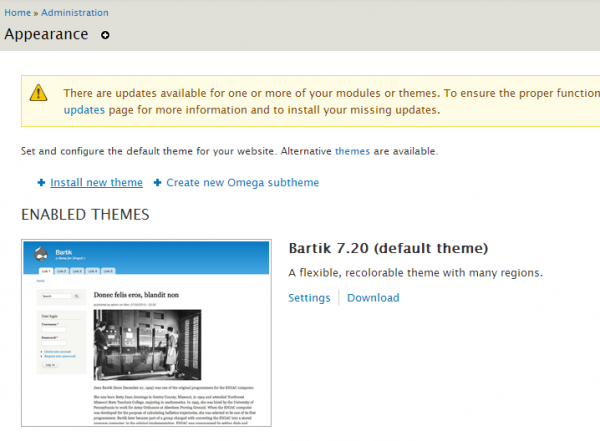
1. Navigate to /admin/appearance
2. Click Create new Omega subtheme
Omega Tools will quickly do all of the file-side setup for your custom theme, create the necessary files, and keep you from needing to edit any code at all.
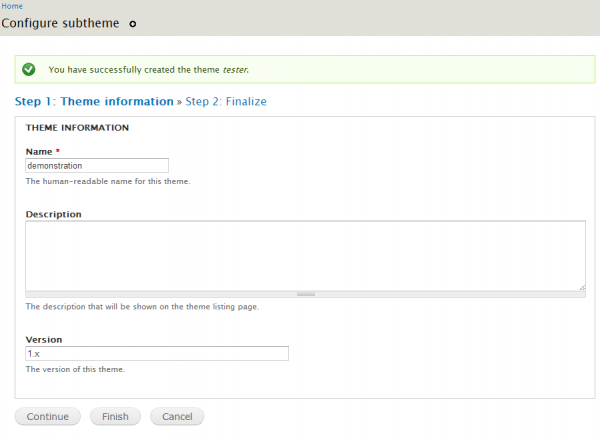
3. Enter a name for your sub-theme. Save and continue.
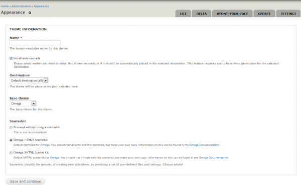
4. Enter a description (optional) and leave the rest of the form in default. Click Finish.
5. Once back to your appearance admin page, scroll down to find your new sub-theme. Click Enable and Set Default. The Omega (and Alpha) base theme doesn’t need to be enabled for your new sub-theme to function.
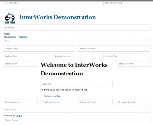
Your New Sub-Theme
Your new home page will look pretty crazy. Omega has two developer overlays displayed by default. We’ll change the default behavior of these soon. For now, take a look at these pretty neat features.
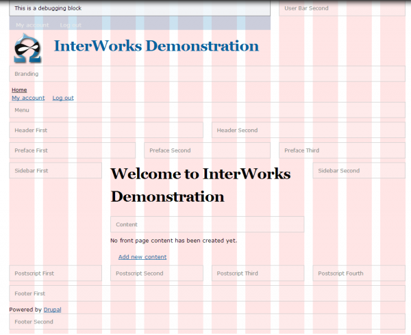
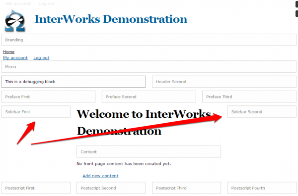
The pink grid overlay shows the foundation 12-column 960 grid and how your page elements line up.
The Blocks Demonstration Overlay (below) shows you, on-the-fly what regions are activated (all of them are activated by default) and where they live.
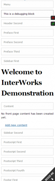
You can also see how the regions will behave when responding to your browser width or device. Check out how the boxes line up at a mobile width:
You can toggle the two developer tools by clicking the checkboxes in the upper-right corner of your browser window.
Turning them both off will reveal a very stark page.
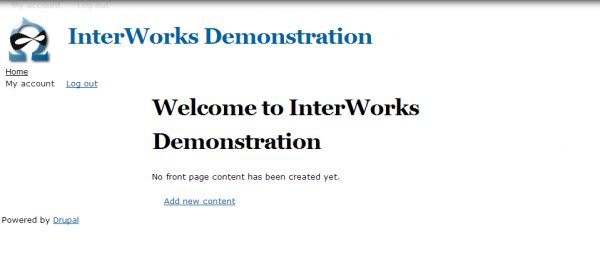
Oh NO!
This is about the point where I, as a new developer, got pretty overwhelmed. There is nothing here! At least with a completed contributed theme or third-party template, I had something pretty to look at from the beginning.
Don’t worry. Because the Omega comes style-free, it allows us far greater power to create a custom and flexible theme. We’ll go through the Omega ‘mobile-first’ styling strategy in another tutorial.
Omega UI
To get started with the Omega User Interface, let’s turn off the developer tools by default. (They’ll still be available by clicking the checkboxes in the upper-right.)
Navigate to /admin/appearance/settings/[your_subtheme].
Click on the Debugging tab on the Left.
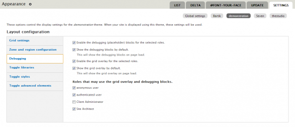
Uncheck ‘Show the debugging blocks by default’ and ‘show the grid overlay by default’. Also uncheck or check user roles you would like to have access to these tools. Obviously only Architects should have this option on a live site, but leaving all roles open here allows you to debug while testing User Roles’ UX.
Click Save.
Now for some Power Flexing
Click the ‘Grid Settings’ tab on the left. Here you can enable/disable the responsive layout for your subtheme. The responsive grid is enabled by default.
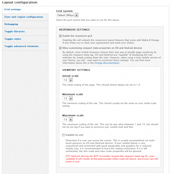
Scroll down the page a bit and you can see which layout settings are available for your theme. Options are:
- Narrow Layout – Generally covers tablets in portrait orientation.
- Normal Layout –Generally reflects a typical desktop computer browser.
- Wide Layout – Reflects a wide-screen monitor or large television.
- Fluid – This one claims (by evidence of the supplied Media query) that this layout is a fluid, mobile based grid.
Narrow, Normal, and Wide offer three breakpoints at which your site will add an additional stylesheet to the mix based on the media query and size of the browser window.
For quick, but responsive theming, you can leave Wide and Fluid disabled. Wide formats aren’t generally used unless you want to specifically target a very large monitor or television. This is great for future functionality of your site as more and more large-format devices will be surfing your site in the near future. Fluid layout requires a bit more deftness with the CSS and isn’t necessary to create a good responsive theme.
Mobile-First Theming
Notice that there isn’t a selection for Mobile Phone. Omega bases its cascade rules whereby the global css sheet is, in effect, the mobile phone layout. Each additional stylesheet corresponds to the layouts selected in the Omega UI.
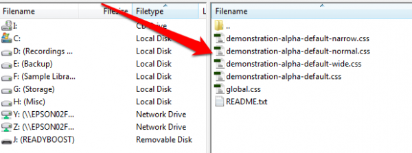
*the above image shows the CSS stylesheets for an Omega sub-theme.
Global.css is the parent stylesheet. [your_subtheme]-alpha-default-narrow.css then inherits and adds its specific layout styles. Then [your_subtheme]-alpha-default-normal.css inherits from them both, etc. etc. (Currently, I really like having my device layouts in separate stylesheets.)
This setup is incredibly clever. The philosophy behind mobile first is pretty simple: Don’t show stuff you don’t need until later. If you hide an element early in the style cascade, the page renders more quickly.
More on styling the different layouts soon to be published in this series.
Omega UI Superpowers
Back on /admin/appearance/settings/[your_subtheme], click the Zone and region configurationtab. With a few clicks we can disable or enable regions in our theme…with zero custom code or templates!
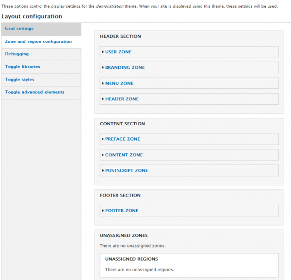
Open any of the accordions and you can remove regions from your pages. For this demonstration, we’ll disable the sidebars in the content section.
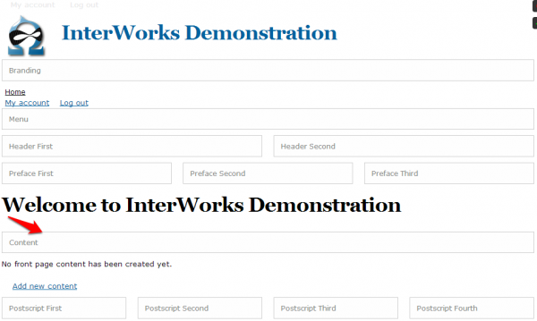
- Un-nest the Content Zone accordion in the CONTENT SECTION until you get to an open SIDEBAR FIRST region.
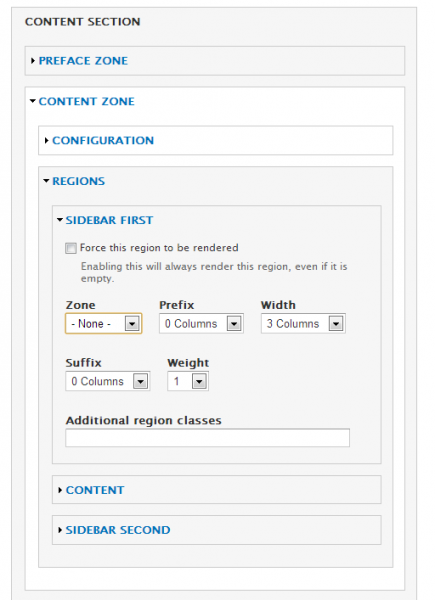
2. Change the Zone drop-down to -None-. Notice here you can also configure how wide your region is, add additional CSS classes, and add gutters. This is some powerful magic.
3. Also disable the SIDEBAR SECOND region as you did for SIDEBAR FIRST.
4. Back on your homepage and with the Block Debugger enabled, your regions went from this:
To this:
Before the Omega UI, you had to create custom php templates to add or remove regions. Though that, in and of itself, is not terribly difficult, it’s still not nearly as easy as ‘point and click’. Omega by default offers a good number of customizable regions allowing for infinite flexibility in design. No more need to “design to the template.”
Lesson 1 summary
We have only barely begun to uncover how powerful the Omega theme engine is.
- Creating a sub-theme is a matter of a few clicks.
- Customizing the region layouts is a breeze.
- Your site is responsive right out of the gate.
- The stylesheet hierarchy is simple to understand and use.
Resources
Omega Documentation: http://drupal.org/node/819164
Media Queries: http://www.w3.org/TR/css3-mediaqueries/
A great article on responsive layouts: http://alistapart.com/article/responsive-web-design
Coming soon
We’ll build on this very basic introduction and create custom layouts for different pages using the Delta and Context modules. Then we’ll start adding some color and style to the theme to get this responsive party rolling.