
Create a legend. Show a legend. Be a legend.
Tableau developers love a succinct workaround, especially when that workaround is more flexible, more intuitive and just as robust as the out-of-the-box functionality. As a Tableau trainer, I get asked a lot of questions about legends and quick filters, mainly around limitations in their behaviour. “Can I use my legend to filter?” “Can I add a reference line to my legend?” This post will cover a quick and easy method for creating your own legend as a worksheet.
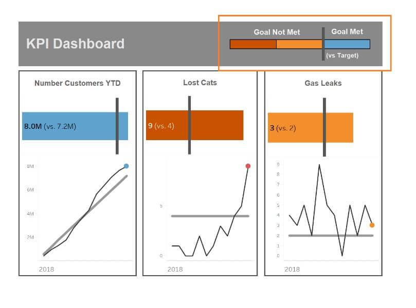
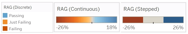
Tableau gives you three options for legends:
- Discrete: a list of applicable values, each assigned a colour
- Continuous: a sliding scale from one numerical value to another
- Stepped: a continuous scale, batched into categories
These are automatically created and quick to add to the worksheet. The discrete option also highlights marks on click by default, but what if we want to use it as a filter or lay it out differently?
Forging Your Legend
RAG (red, amber, green) is commonly used to show the bad-to-good scale. Colour-blindness should be considered here, though, with Tableau opting to avoid alienating 7% of men and 0.5% of women by going with a blue and orange default scale instead.
In my example, I’m using a basic KPI dashboard, showing the result as a colour. “How are we doing now?” is the most important question a KPI chart must answer, and bold colours are a sensible way to encode this information.
Step 1: To create mine, I used a simple and common trick. First, I added an ad hoc field to columns with AVG(1) as the calculation. This will return the average of 1 for all rows in the underlying data and therefore will always draw a bar starting at zero (0) and ending at 1.
Step 2: We want to aggregate for each of our colours, so I dragged the RAG field (which defines my result per month) to the colour card:
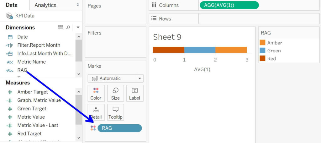
Step 3: I then manually sorted the marks into the right order by clicking and dragging in the RAG legend on the right.
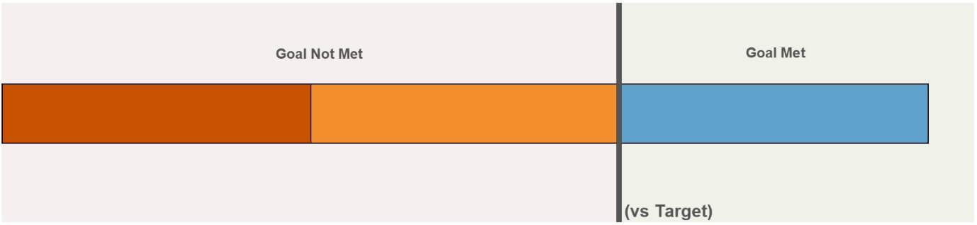
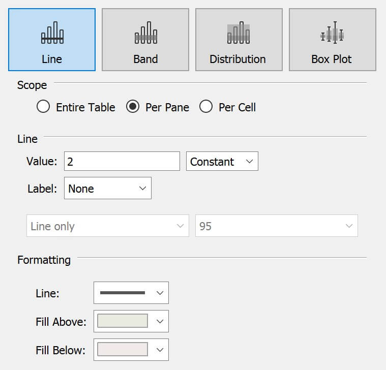
Step 4: Add a constant line by clicking on the AVG(1) axis and clicking Add Reference Line. This line should ideally match your charts on your dashboard. Sprinkle on some Fill Above and Fill Below the line to add extra flavour:
Step 5: Now to tidy up. Hide the AVG(1) header, remove column gridlines if visible, and add annotations by right-clicking in space and clicking Annotate > Area…
Building Legends as a Worksheet
This can now be used to filter and highlight your dashboard using dashboard actions. It also has a tooltip that could be used to hide away further instruction on how the dashboard should be read. By building legends as a worksheet, we control the functionality we offer to the user.
I’m sure there are hundreds of neat tricks to build off the back of this, so show me your mods!