
Let’s talk Tableau. As an accredited Tableau instructor (and a self-proclaimed Hermione Granger), I’ve got a question that just won’t leave my mind: it has to do with heat maps and highlight tables. But first, a little background on those chart types.
In Tableau Desktop I: Fundamentals, instructors teach two visual variations of comparing metrics across a grid or table: the highlight table and the heat map.
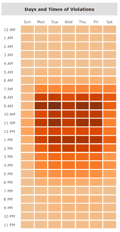
Highlight Table
- Great for using color as a visual cue to highlight important areas of a single metric
- Great for analyzing discrete fields with lots of members
- Mistakenly called “heatmaps” by many Tableau vizzers due to the intensity, or “heat,” of the colors
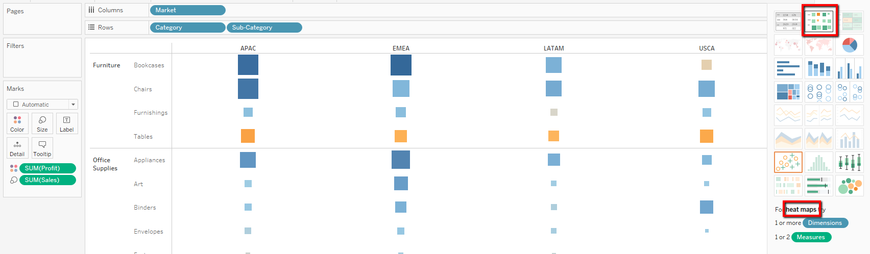
Heat Map
- Good at comparing TWO (typically) continuous fields across many dimension members using size and color
- Not as heavily used (in my experience) but potentially good for showing patterns
Enter Tableau 2018.3
Tableau’s 2018.3 beta promises a new mark type that will be a game changer for areas of high concentration: density. This density mark type can be used to create heatmaps. See where I’m going with this?
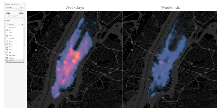
While I am incredibly excited to compare this new mark type with the current solution, density maps, I’m curious if I’m the only person feeling like a major pedant. My brain wonders what we’ll call the map above and how we’ll clearly differentiate the charts.
My Two Cents
In a frantic attempt to provide a suitable alternative to the “heatmap” chart type, I did a bit of brainstorming:
- The concentrated chart type
- The oodles chart type (wouldn’t that be fun?)
As I anxiously anticipate the release of 2018.3, I hope all of you will take a moment to ponder my silliness. I look forward to hearing your suggestions as we enter this new age of Tableau Desktop.