
Heading to my house in Durham, North Carolina and looking forward to a long bike ride and fresh peaches at the market. Spent this last week in New York City working with a great client with some true Big Data; as part of a follow-up with them I went looking for some documentation on the technique I describe here and couldn’t find any. So, I decided to write my own!
The basic notion here is that we’re going to use the combination of a Calculated Field and a Parameter to swap out one measure for another in our visualization. If you’re unfamiliar with Parameters, here’s a great resource to review. We’ll review the basic technique, explained here, and expand our parameter’s scope to be useful in the visualization itself.
So, without further ado.
Step 1
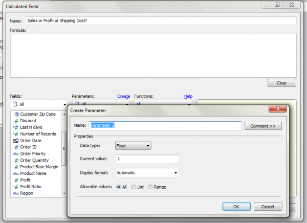
I opened the Superstore dataset and I’m going to create a new calculated field called “Sales or Profit or Shipping Cost?” and a parameter with the same name, so I open up the dialog to create a new Calculated Field and then hit the “Create Parameter” link directly from that dialog.
Step 2
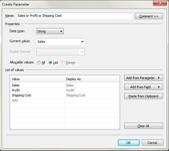
We need a controller, so I created a string based Parameter that has one of three values.
Step 3
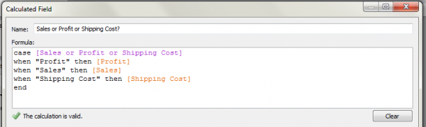
Using a case statement, we can create a formula for our calculated field that uses the parameter to toggle between values using a case statement.
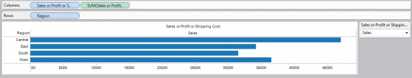
Step 4
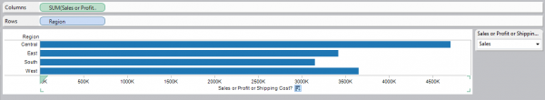
There, we’ve built an extremely simple visualization using my newly built calculated field, the Region field, and exposing the Parameter Control for my new Parameter. The problem with stopping here is immediately apparent – my axis is now labeled “Sales or Profit or Shipping Cost”. Well, which one is it? The last thing we want to do is have to guess, so follow the next few easy steps and we can eliminate the problem.
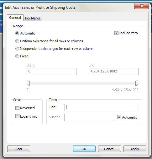
Step 5
Edit the axis and remove the title. We want to keep the #’s, but get rid of the unhelpful “Sales or Profit or Shipping Cost?
Step 6
Lets drag our Parameter onto the visualization directly! Now you can see we have a column that lists the parameter value. This is the key step.
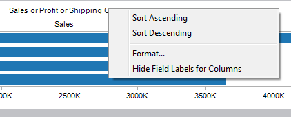
Step 7
A bit of cleanup, right click and hide the field labels for columns to get rid of the unnecessary “Sales or Profit or Shipping Cost” but keep the value itself.
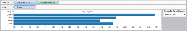
Step 8
The finished product! A nicely labeled visualization where the axis will be labeled with whatever we choose as the parameter value.
I’ve cleaned up the example and put together a quick little dashboard that shows you a few more ways we can use the parameter value to add important context to our visualization. Remember, the less work our end user needs to do when they’re looking at the dashboard, the more the story the dashboard stands out.
Wheels Down! Talk to you soon…