
At 27,000ft on the way home from the Big Apple (New York City) with another quick blog post. No mud, barbed wire, or fire pits here, sorry to disappoint.
I had a question come in about Multi-Measure Dual Axis Charts and I thought this might make a fun blog post. Before I get to the Multi-Measure part, let’s review dual axis charting. Skip Ahead to the Tricky Bit if you’re already a Ninja.
Dual Axis charting in Tableau is a cinch – in fact, when I teach seminars on Tableau, I typically show three different ways to achieve the end result. The technique is something we apply when we’d like to show the relationship between two measures across a single dimension.
A nice use case that highlights this would be if someone asked me “How do our Sales relate to our Profit across time? Are there similar patterns of Increase or Decrease?” I often demonstrate the following basic technique using the Superstore Dataset that comes packaged with Tableau Desktop.
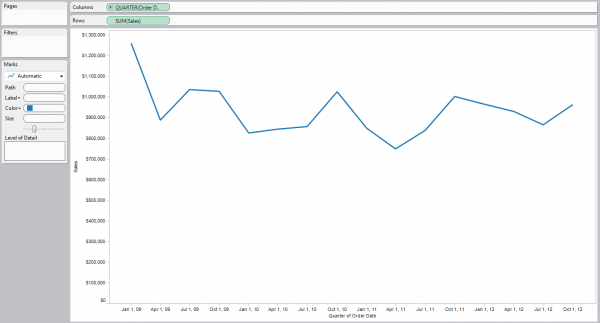
Step 1: Display Sales over Time
Here, I used a continuous version of Quarter, and we can see that Tableau has defaulted to a line chart to show me the change over time.
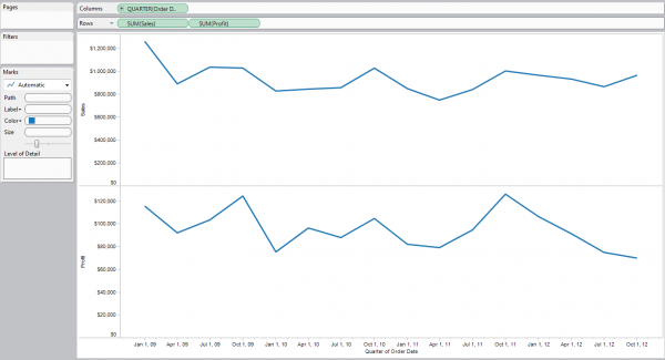
Step 2: Include Profit in my Visualization
I’m simply going to drag the Profit pill onto the rows shelf and I get what I expect, another row for the second measure. Again, Tableau is showing me trending as a line.
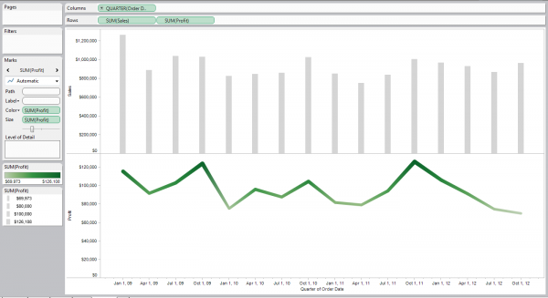
Step 3: Change the Mark Types and color them.
There are several ways to select multiple mark types:
- Right-click on the Pill itself and select a new Mark Type (my preferred method)
- Right-click on the Axis and select a new Mark Type
- Right-click on any Mark and select a new Mark Type
- Use the Marks card to select Multiple Mark types and then select one for each
I also decided to change my colors and sizing so that my Sales bars are faded a bit (to make a better background), and that I highlight change in my profit line by adding thickness and color.
Step 4: Create a Dual Axis Chart.
The concept here is that instead of having a single row for each measure, I’d like to see both measures on the same set of rows, so that I can better evaluate differences between the two or trends that appear over time. Again, there are many ways to get to this solution – I’ll tell you the one I use (click on the Profit Pill and select Dual Axis). Can you find more?
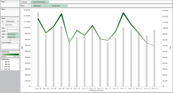
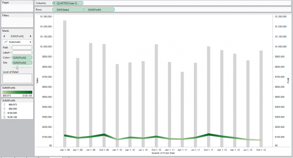
Step 5: Reality Check
Having run a small company before, I can tell you it would have been really nice if sometimes my Profit exceeded my Sales numbers. I know it never happened to me, so I’m going to point out that if it hasn’t happened to you either, then you need to remove that misleading element from your visualization. Synchronize those axes by Right-Clicking (Anyone who’s been in one of my seminars will remember Rule #1 I hope).
That’s more like it. I’ve successfully created a Dual Axis Chart!
I’ve just re-iterated the technique for showing multiple measures with overlapping axes. That’s great, but it didn’t answer the question I was asked – what we’re looking to do is show the same background bars, but have multiple measures expressed as lines over time.
Hmm…does this sound familiar? It sounds to me like we’re trying to show multiple measures on a single axis, and then merge that technique with the one above to show multiple axis in the same plane (hint: I just showed you that one).
Let’s look at another use case – imagine someone just asked me “How do our Marketing costs relate to our Profit and Sales over time?” We might want to show Sales as a bar on one Axis and both Profit and Marketing as lines superimposed on Sales on another axis.
So, the question is: how do we show multiple measures on a single axis? Easy! Use the Measure Names/Measure Values Key/Value pair! The basic technique is simple – let me show you using another packaged data-set, the Coffee-Chain.
Step 1: Drag out Date as a continuous Quarter.
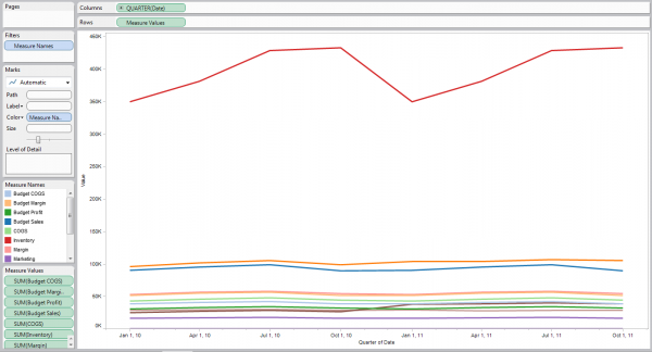
Step 2: Drag out Measure Names to the Color Shelf, Measure Values to the Rows Shelf.
You’ll get a lot of lines – one for every Measure.
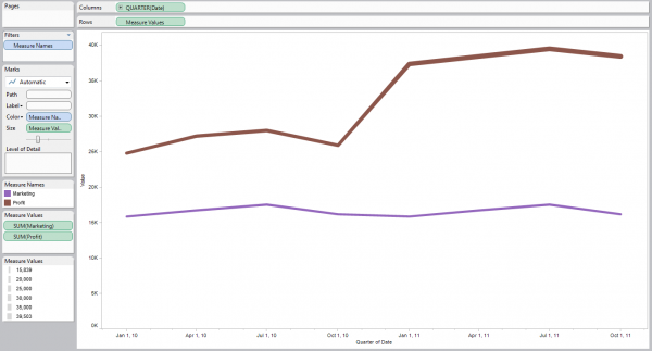
Step 3: Filter that down.
Either use the Filters shelf (notice that Measure Names is already there) or remove (drag out) Measures from the Measure Values card. You’ll start with the image on the right, and if you filter down to “Marketing” and “Profit”, you’ll end up with a nice two line chart.
Step 4: Add in Sales.
Just like in Steps 2 & 3 above, I’m going to add Sales to my rows shelf to generate another row. Then I’m going to right click on it to change my mark type to Bar. Lastly, I’m going to specifically colour my Sales bars with the same light grey background.
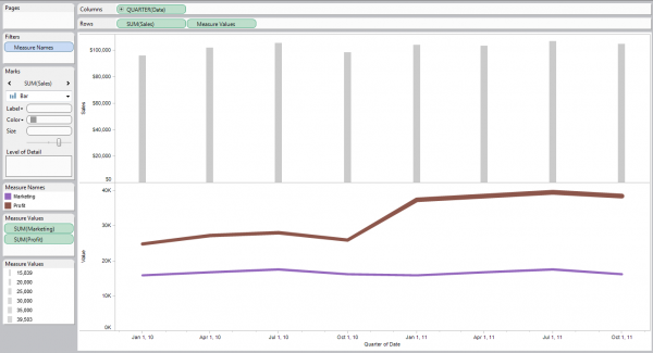
Step 5: Bring it all together!
Simply take our two axes (one having two measures, the other only one) and create a Dual Axis Chart out them. I mentioned four ways to do this above – pick the one that works for you. Remember, unless you have a very good reason for doing so, always follow Best Practice and synchronize your axes after creating a dual axis chart. You should end up with something like this:
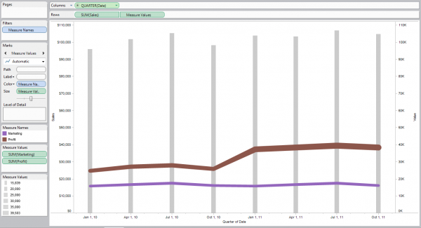
Great! We’ve successfully answered the business questions that drove our use case, and had some fun putting together a fairly complex Multi-Measure Dual Axis chart.
I’ve included the visualizations above in a TWBX file. Feel free to download and play around. Should be landing anytime now…