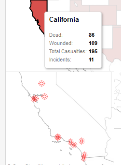
In a previous blog post, I mapped America’s Deadliest Shootings based on a timeline put together by the “Los Angeles Times.” A topic not often discussed is the order of elements when laying out floating containers on your dashboard and how this can ultimately impact user experience.
Notice the context menu when right-clicking on an element in the Layout pane when designing Tableau dashboards:
blog post) above a map of the continental U.S. to achieve a pop-up detailing shooting incidents per state: