[Update: in theory, v6.1.1 has made it easier to create the bars described in this post by using REPLACE() and SPACE(). However, at time of writing (19 Aug 2011) there is a problem: while the solution works fine in Tableau Desktop, the view won’t display on Tableau Public – have a look at the “Using REPLACE and SPACE() tab in the embedded workbook below. The calculations have also been optimised using parameters.] Consider this map:
 It highlights one of many situations when pie charts don’t work. The smallest pies are so small you have no chance of making out the size of the slices. And what if I wanted to show Profits on the viz, as well as Sales and Product Type? The Tableau guys have come up with a way of using Gantt Bars to emulate a bar chart and maybe solve some of these problems. This works okay, but has its own flaws; mainly that it’s still hard to make out the individual bar segments. Well, how about using a bar chart inside a tooltip? Surely you can’t do that? Well, yes you can:
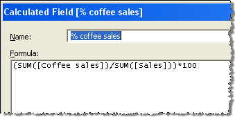
The viz above solves several problems. The circle size is based on Sales, and Profit by colour. And the tooltip shows the proportion of sales of each Product Type. With just a mouse-hover, you’ve revealed a new dimension on the data. Three dimensions on one map viz – bingo! How do we do this? Well, first we need to decide if our dataset is suitable. First of all, you need a known number of values in your tooltip-chart dimension, because we’ll be creating a calculated field each one. In the above, we only have four Product Types, so that’s a suitable candidate. Secondly, there is a maximum length that the bar can be. Too long and it will wrap around in the tooltip. As we’ll see, the bar is built using a text string, so we can’t just have an unlimited bar with a value in the 100s. Percentages work best as they are going to have a maximum value of 100. For each Product Type, we need two calculated fields. One works out the percentage of sales of that product type:  and the other works out the length of the bar. How do you build a bar out of text? Simple: use the ALT+219 ASCII character. That’s this one: ?. You create it by pressing the ALT key and then 219 on the Number Pad (using a laptop? Copy and paste the one in this blog instead!). We need to create a parameter – [Bar] – which is one loooong string of 100 ? characters, and then create a calculated field that is a subset of that, based upon the % value in your other calculated field. Here’s the text of that field:
LEFT([Bar],ROUND([% coffee sales]))
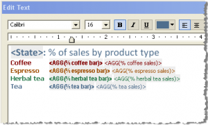
Now we have two calculated fields for each Product Type. Drop them all onto the ever-so-useful Level of Detail shelf, and now you can build your tooltip as follows:  You’ve done it! You’ve now become a tooltip genius. Using the skills we’ve learned in our other tooltip posts (basics here, and conditional formatting here), your tooltips can be as jazzy as your vizzes themselves! Those of you who are big Excel users may know where the inspiration comes from. This post gives a huge Tip o’ The Hat to the posts from Juice Analytics, Daily Dose of Excel, Jon Peltier, and Chandoo that showed us all how to do in-cell charts in Excel in the last few years. Also, thanks to Richard Leeke on the Tableau forum for giving me the last piece in the jigsaw for this idea: Excel has a REPT function that can be used to create the long string. Tableau doesn’t. Richard pointed out that the only way round this is to type the string out manually and take a substring of it. Nice!