This is the second post about tooltips. In this post, I will describe a technique to add conditional formatting, of a sort, to your viz. This isn’t a natively supported feature in Tableau (although it would be lovely if it was!), so you have to do a bit of extra work to do it.
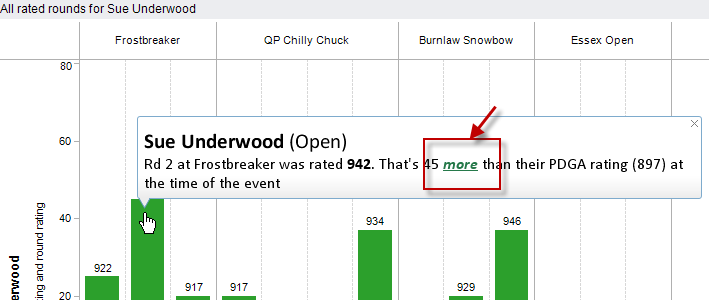
I’ve implemented colour-based conditional formatting in a few Tableau Public dashboards. My disc golf analysis dashboards use colour to emphasise the good/bad performance of players. Click here to go to the viz; the tooltips are below.
If the player played better than their rating, they’d get this tooltip:

If they played worse, they’d see this tooltip:

I’ve also used colour to represent a political party’s colour, as shown in my UK General Election viz. The main dashboard is here, but I’ve embedded one of the worksheets below. Hover over the different parties (Labour, Conservative, etc) to see the different colours in the tooltips:
There are a few limitations to using colour. Essentially, this boils down to having a Dimension or Group where the possible values are known ahead of time and are relatively small. Why’s this? Because to take advantage of conditional tooltips, you need to create a specific calculated field for each Dimension value.
Here’s the steps to create the coloured Party tooltip in the General Election dashboard.
- Determine the list of items that will need their own colour. For our general election, there are four. One for each of the three main parties: Labour, Conservative and Liberal Democrats, and one for everyone else (Other)
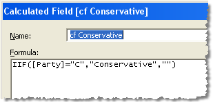
- We need one calculated field for each of the four values. It is a basic IIF function that either returns the Dimension value as a string, or an empty string (note – it must be an empty string, not Null).
In my dataset, the underlying party column was a single letter, so the calculated field for Conservatives was this:

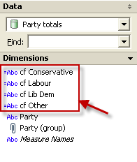
- Duplicate that calculated field for each Dimension value, until you have all the ones you need:

- Now put all four of those fields onto the Level of Detail shelf:

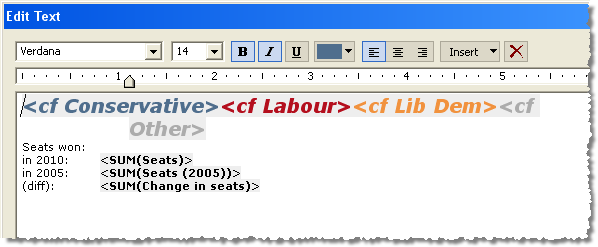
- The final step is to edit the tooltip. This is quite straightforward, but looks a bit messy. Order the calculated fields so that they are all adjacent in the tooltip text. Format each calculated field with the colour that you want. For the election tooltip, this looks like:

That’s it! All but one of the calculated fields will be Null at any one time (since you can’t hover your mouse over more than one mark at a time). Therefore, despite there being four items in the tooltip, the viewer only ever sees one. And it just happens to be in the correct colour. Bingo!
