
I came across an interesting article today on WashingtonPost.com by Niroj Chokshi. It visualized the impending effects of the estimated 1.3 million people that will lose unemployment benefits when they expire on Saturday Dec. 28. I won’t get into the politics of the issue, but I do think The Washington Post could improve on their visualizations by utilizing dynamic maps in Tableau. As such, I have recreated these visualizations by utilizing Tableau’s Dynamic Maps and Dynamic Number Formatting features. I also thought this would be a great opportunity to educate Tableau users on how they can implement Dynamic Number Formatting.
First, let’s check out the maps.
Dynamic Maps in Tableau
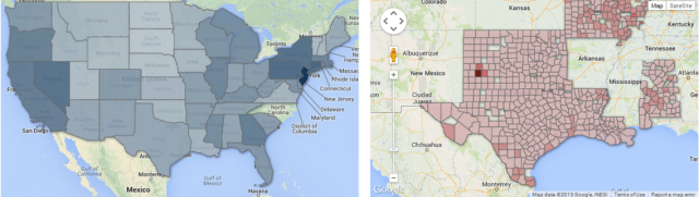
In The Washington Post’s example, we see a basic overview of the share of population affected on the state and county level:
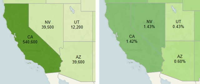
By utilizing Tableau’s out of the box mapping functionality, we can create dynamic visuals that not only shade by a certain measure, but also toggle between different measures and drill-down functionality to the county level. In the interactive dashboard provided below, I can examine those affected by toggling between per capita vs. total:
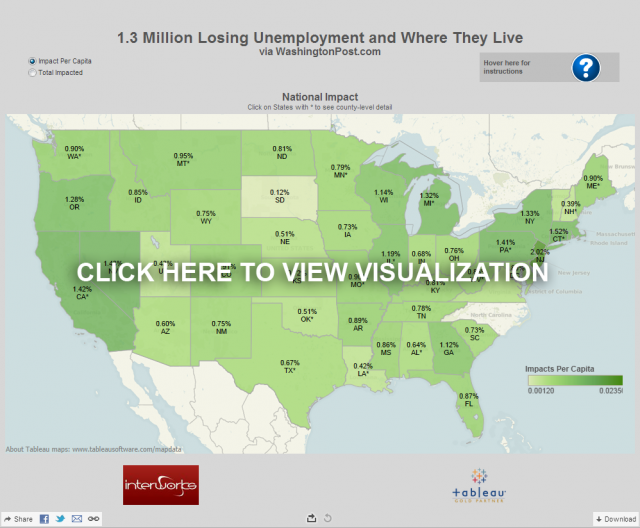
It’s easy to see that the Tableau’s Dynamic Maps allow additional functionality for the reader, providing even greater value to the article. Now that we’ve seen how to express more information through Tableau’s mapping capabilities, we can move on to yet another way that Tableau adds value.
Utilizing Tableau’s Dynamic Number Formatting
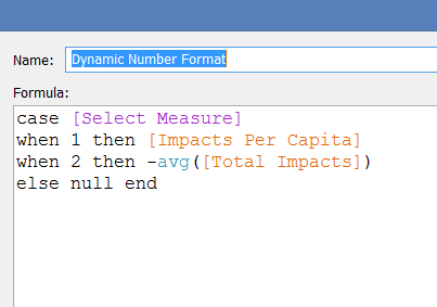
For the Tableau users out there, I will discuss below how to utilize dynamic number formatting on the map. As we toggles between per capita and total measures, we have two different resulting numbers; one an integer (left) and the other a percentage (right).
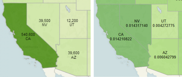
It is simple enough to put a dynamic measure parameter into the viz, but without formatting it appropriately, we see the California value at 0.014210822 instead of the simpler 1.42%. That’s where dynamic number formatting comes in.
This method takes advantage of the fact that all of our data is positive and “tricks” Tableau into thinking that one of our measures are negative and the other positive. Tableau then formats each differently. Let’s take a look at how it’s done.
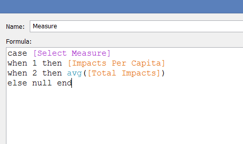
Create a Calculated Field
We have a calculated field for our dynamic measure as follows:
Duplicate the Calculated Field
We then duplicate the calculated field, with one change: placing a “ – “ in front of the avg([Total Impacts]):
Now, we’re able to drop “Dynamic Number Format” onto our “Text” button on the marks card. From there, we can utilize custom formatting options to visualize our data appropriately.
Apply Custom Formatting
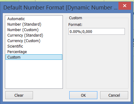
Right click on the new calculated field, “Dynamic Number Format,” and select “Default Properties” > “Number Format” to bring up the dialog box. When applying custom formatting, Tableau allows us to determine how to format positive and negative numbers differently. Usually, it does this so we can utilize parentheses or other accounting syntax. Since we have made [Total Impacts] negative here, we can format these fields differently. The example below allows the positive numbers to be formatted as percentages and the negative numbers as integers:
The resulting viz should now toggle appropriately between per capita and total with proper formatting.
In Review
As a recap, here are the quick steps to utilize dynamic formatting across parameter-ized measures:
- Duplicate dynamic measure field and apply a “ – “ to one of the measures
- Apply duplicated field to your text button on marks card
- Edit default number properties for duplicated field, apply [format 1];[format 2]
- Toggle between measures in viz to check that formatting is working appropriately
How else could you utilize dynamic formatting in your visualizations?