
Recently NASDAQ OMX released their NASDAQ Economic Calendar Reports on Facebook. One of these reports attempted to explain that consumer confidence rose 6% month-over-month in July 2012. Unfortunately the visualization was so poorly designed that this information is almost impossible to extract. Thankfully for you, I have taken the liberty to visualize this data using proper design techniques that make the truth about consumer confidence shine through. First, lets evaluate their visualization:

- The first thing I noticed on this report was that January seemed to be weightlifting month. This led me to scan down the months on the left of the page trying to make the association between their flashy icon’s and the month. At this point I actually have completely lost why I was looking at this visualization in the first place and am playing a word association game in my head which was fun, but not at all informative.
- After I snapped out of my daydreaming of candy corn and weightlifting I started to look for the 6% increase they had mentioned in their post. The next place I looked was in the top right and then I scanned the image going down the right side of the page.
Ah ha! I found it! All of the months are showing an increase for 2012 as the trend appears to be going up when I scan from left-to-right (the direction almost all western cultures read).
WAIT! NO! They put the years in reverse chronological order?!…so…I have to scan from right-to-left, the opposite direction my brain has been programmed to read since I was a kid. Is the intended audience from an eastern culture that is meant to consume this data from right-to-left such as Chinese or Japanese? Again, the design has completely lost me at this point.
- Lastly the use of color in this visualization draws attention to all the wrong elements. The actual data is displayed using a thin light colored line on top of a medium shade of gray. Assuming that all the distractions were removed and the data were oriented correctly (left-to-right) it still would be difficult to see that there was a 6% increase in July ’12. NASDAQ, I expect more from you…
In my view below, I have tried to address all of the issues I found with their view plus add some more context including a Year over Year comparison and detailed Month over Month comparison for each year. Below the view I explain the techniques for each section of my view. Please let me know your thoughts!
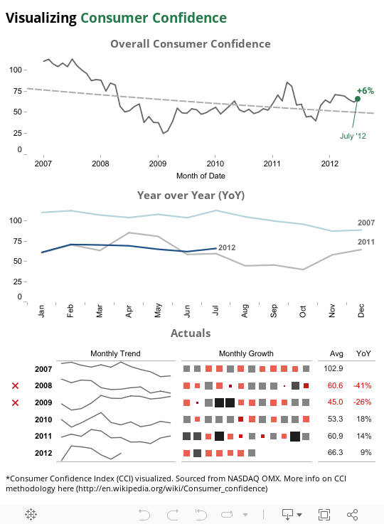
In the first section you find some context about the source of the data long with a reference to the methodology behind the Consumer Confidence Index. Next I show an overall trend by month going back to 2007. I added a reference point for July 2012 and a label clearly showing the +6% increase in consumer confidence. In the background I added a trend line showing the overall trend since 2007 going down. We’re not out of the weeds yet.
In the next view I show how we are doing this year, 2012, compared to last year, 2011. You can easily see that we’re slightly ahead but more importantly the trend in consumer confidence is lining up closely with that of 2007 when Consumer Confidence was at a high point.
Below the Year over Year comparison I have added a detailed look at each year. Reading from left-to-right I show an indicator if the average Consumer Confidence Index for the year was below or above the previous year. Easily you can identify 2008 and 2009 as downturns in Consumer Confidence. Next to the indicator and the year label I have a sparkline trend for how the year went. Next to that you can see month by month if the index was high or low (size) and if it were an increase or decrease over the previous month (color). Finally to the right you get the average Consumer Confidence Index and percent change year over year.
I hope you find these techniques in visualization and flow of information design helpful. The ultimate goal is to convey the most amount information as quickly as possible with considerably small screen real estate. As always please send me your feedback on my views as well, I’m always open to feedback.