
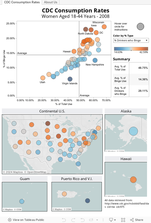
In August, the CDC published some data and charts related to Fetal Alcohol Spectrum Disorders (FASD). Included was the following map breaking down alcohol use and binge drinking by state:
The chart contains all the relevant information, but is less helpful than the typical excel spreadsheet. The visuals do little to assist us in our understanding, the over-reliance on text slows our ability to make meaningful comparisons, and the font size and color make for a very hard to read graph. To improve the analysis process, we’ve fully leveraged Tableau, adding complementary and interactive visuals that help us come to more meaningful conclusions:
What Changed and Why
- The map now displays one metric at a time. This speeds up our ability to compare data points and discover outliers. Because of this change, color is now dictated by a drop down menu (using Tableau Parameters). This gives flexibility to the view, while allowing users to focus on the key metric they want to view. The dropdown options include the original CDC metrics (Any Use and Bing), as well as our added % of Drinkers who Binge
- The primary chart is now a scatter plot. This allows the user to quickly determine which State/Territory has the highest general alcohol use in the population (X-Axis), highest binge drinking in the population (Y-Axis), and with the color default of % of drinkers who binge, the user can also see which states have a disproportionate amount of binge drinkers compared to the typical drinking population.
- Each chart acts as a highlight filter for the others. This allows the user to grab a section of States/Territories from the scatter plot, and see where they are on the map (or vice verse). This supports the iterative analysis process by allowing questions to be asked and answered very quickly. In moments we can find out “what does drinking in the Northeast look like?” or “where are top 4 binge drinking states?”
- Simple usability additions were added to complete the dashboard package. The instructions and definitions can be displayed by hovering over the circle in the top right (“Hover Help” is an idea proudly stolen from the wonderful Steve Wexler). Some overall summary data was also added to give context to state-specific data.