Flowing Data challenge: Getting the News

Data

Flowing Data challenge: Getting the News

//

Flowing Data visualization challenge


Over at Flowing Data, Nathan Yau sent out the challenge to visualize the Pew Research Center data about how people get their news. There are many excellent examples created that can be seen over in the Flowing Data comments (some very different, some improving on the original).

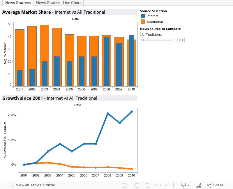
My take does the following:

  1. Compares only two sources at once. A parameter control allows the user to toggle through Internet versus any other (including an average of all the traditional sources). This really emphasizes the growth of the internet (especially in compared to newspapers).
  2. I choose to use two visuals, one that showed the % of respondents, but the other showing the rate change compared to the base year (2001). Showing both at once tells the story in a much stronger way.


KeepWatch by InterWorks

Whether you need support for one platform or many, our technical experts have you covered.

More About the Author

Ben Bausili

Global Director of Product
Maturing Analytics: User Adoption and Data Delivery Welcome back to our journey in maturing analytics. In Part 1, we looked at our job to be done and why it wasn’t building dashboards. In ...
Maturing Analytics: Why Dashboards Fail In Part 1, we looked at our Job to be Done and why it wasn’t building Dashboards. The key takeaway is to focus on user value and solve ...

See more from this author →

InterWorks uses cookies to allow us to better understand how the site is used. By continuing to use this site, you consent to this policy. Review Policy OK

×

Interworks GmbH
Ratinger Straße 9
40213 Düsseldorf
Germany
Geschäftsführer: Mel Stephenson

Kontaktaufnahme: markus@interworks.eu
Telefon: +49 (0)211 5408 5301

Amtsgericht Düsseldorf HRB 79752
UstldNr: DE 313 353 072

×

Love our blog? You should see our emails. Sign up for our newsletter!