
You may have the job title of data analyst, or you may work in HR or sales. Regardless, the versatility of modern data visualization tools allows everyone access to self-serve analytics. If you already have Tableau experience but are interested in Power BI, this is the guide for you!
For steps on how to create your first report in Power BI Desktop from scratch see Robby White’s blog.
Power BI
While Power BI Desktop serves a similar purpose to Tableau Desktop, the beginning experience is a bit different, so let’s start the breakdown there.
First, I will explain some differences in terminology used for Power BI Desktop versus Tableau Desktop.
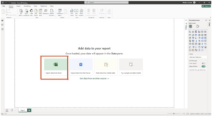
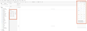
When you first open up Power BI Desktop, you will be presented with a screen asking you to select your data, I will be importing a Sample Superstore Excel file:
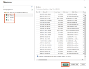
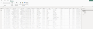
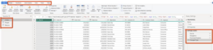
After selecting the file, you will see the data navigator window appear. Check the boxes to select the tables you want and click Load. This is clean data, so we’ll ignore the transform Data option for now:
After loading your data, you will be shown a blank page for your report:
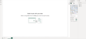
This empty canvas will remind you of your first worksheet in Tableau:
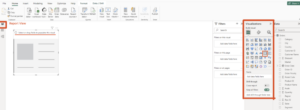
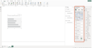
Now that we understand how to connect to data in Power BI, let us consider some first differences between the two desktop environments. While in Tableau you create individual charts or visuals on a worksheet, you begin on the report view in Power BI. On the right, you will see the visualizations tab. By clicking one of the chart icons, you insert the chosen visual into your report. Notice without data, the tile inside your report will prompt you to “Select or drag fields to populate this visual:”
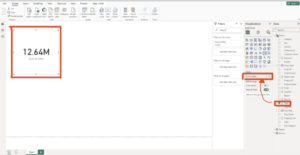
For example, to populate data into a BAN “Card,” select the “1,2,3” chart then drag the Sales field from the data pane directly onto the tile. The data will automatically be aggregated and summed by default:
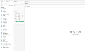
The equivalent of creating this simple card is dragging the Sales field onto your marks card on text in Tableau and customizing the label:
While this is intuitive so far, lets discuss some basic discrepancies in diction between the two platforms:
- A worksheet in Tableau is a tile in Power BI.
- The Power BI report page is essentially a Tableau dashboard.
- The term “dashboard” is used in the Power BI, but only relevant on Service (Power BI’s online version). Dashboards are much more limited in functionality, but allow visuals from different reports to be pinned alongside each other.
- A Power BI Report itself is similar to a Tableau Story or a Tableau Workbook of multiple dashboards that can be linked via navigation or listed in sequential order as you tell a story with your data.
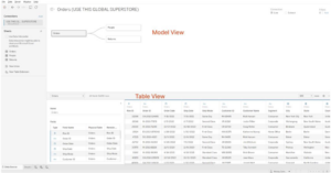
On the top left corner of the Power BI environment, you will see these three buttons representing the three main Views:
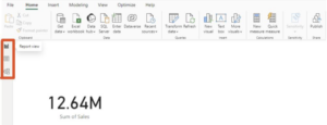
The top button is the Report View:
- Design and create interactive visualizations such as charts, graphs, tables, slicers, and maps to represent your data.
- Primary interface for creating reports.
- Add filters and manage interactions to explore the data dynamically.
- Report view provides a canvas like interface where you can drag and drop visual elements and arrange them to create meaningful insights.
The middle button is the Table View:
- The Table view provides a structured representation of your data tables similar to a spreadsheet.
- Displays in tabular format, showing rows and columns of the data.
- Use table view to perform basic data manipulation tasks such as sorting, filtering and grouping data.
- Table view is useful for inspecting the raw data, equivalent to Tableau’s View Data button. Tables are easy to interpret and show any new calculated columns added.
The last button displays the model view:
- Model view is where you design and manage the data model behind your reports.
- It allows you to view and modify relationships between different tables, create calculated columns and define measures using DAX (Data Analysis Expressions) language.
- You can also define hierarchies, set data categorization and manage roles and perspectives in the model view.
- Model view is essential for ensuring data accuracy, optimizing performance and creating a foundation for building meaningful visualizations in the report view.
In summary, the report view is where you design visualizations, the table view is where you inspect and manipulate data, and the model view is where you organize the underlying data model. Together, these three views work together to enable users to analyze, visualize and gain crucial insights from their data using Power BI.
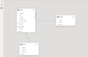
In Tableau, the model view and report view of Power BI roughly combine to form Tableau’s Data Source Tab:
Now that you understand the basic framework of the basic differences in the overall environment, I will break down some differences in various aspects of the environment.
Since we already learned how to connect to our data, let us begin with data preparation:
- In Tableau, you can work within the Data Source page of Tableau Desktop, or use Tableau Prep, a separate tool for data preparation.
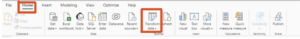
- Within Power BI Desktop itself, the tool comes with its own data preparation tool called Power Query Editor and is found under the Home tab and queries group on your top ribbon where it says “Transform Data:”
Upon clicking this transform data button, you will enter the Power Query Editor. This is equivalent to Tableau Prep, but it’s located directly inside of the report where the cleaned data will be used:
 On the left, you can see the different tables in our data model, so click one of these to navigate and make changes to another table, also called queries. Along the top ribbon are various tools used for changing your data or data structure. On the right-hand side, there is an applied steps list, allowing you to easily track changes you have made and backtrack easily at any point. Once done, click the “Close and Apply” button in the very top left section of the home tab, which will return you back to whatever view you were in when you clicked the “Transform Data” button.
For Data Modeling:
- Power BI’s Data Model View is used for managing relationships and creating calculated columns and measures. In Tableau, use the data pane for managing fields, calculated fields, groups and sets. Power BI also uses DAX (Data Analysis Expressions) as a language for creating custom calculations. While the logic takes a bit of time to adjust from coding Tableau calculated fields and such, view one of our DAX blogs for help in this transition!
For Data Visualization:
- In Tableau, the main tools for creating visualizations are the marks card and the Show Me pane:
- In Power BI Desktop, the visualizations pane is a drag-and-drop interface for adding charts, tables, maps, slicers, etc. The fields pane is used to manage the fields and measures used in the visualizations:
For Tableau Dashboard/ Power BI Report creation:
- Click on an individual visual in your report to resize, move around, format and more using the visualization pane! Coming from Tableau where you can choose tiled vs. floating in your dashboard tab, think of everything in Power BI as floating.
- In the Power BI visualization pane, there are three buttons left to the right (depending on your overall settings, these could be oriented vertically or horizontally):
- The first button allows you to customize what goes into the visual, such as what fields are going on each axis, tooltips, etc.
- The second button lets you format everything such as color, size, gridlines, data labels, etc.
- The third button can be thought of as the Analytics Pane in Tableau, where you will add constant lines, trend lines, box plots, etc.
For Sharing and Collaboration:
- In Tableau, you publish to Tableau Server/Online (Cloud). These platforms are used for sharing, collaboration and permissions control.
- On the Power BI side, you can publish to Power BI Service, which is a web-based platform for collaboration and sharing.
- Notes: Admins control and manage the settings for both Tableau Server and Power BI Service.
For help with either Tableau or Power BI development, reach out to InterWorks with any questions or for help! There will be upcoming blogs that focus more on the differences between Tableau and Power BI in other aspects such as data management, server options and more.