
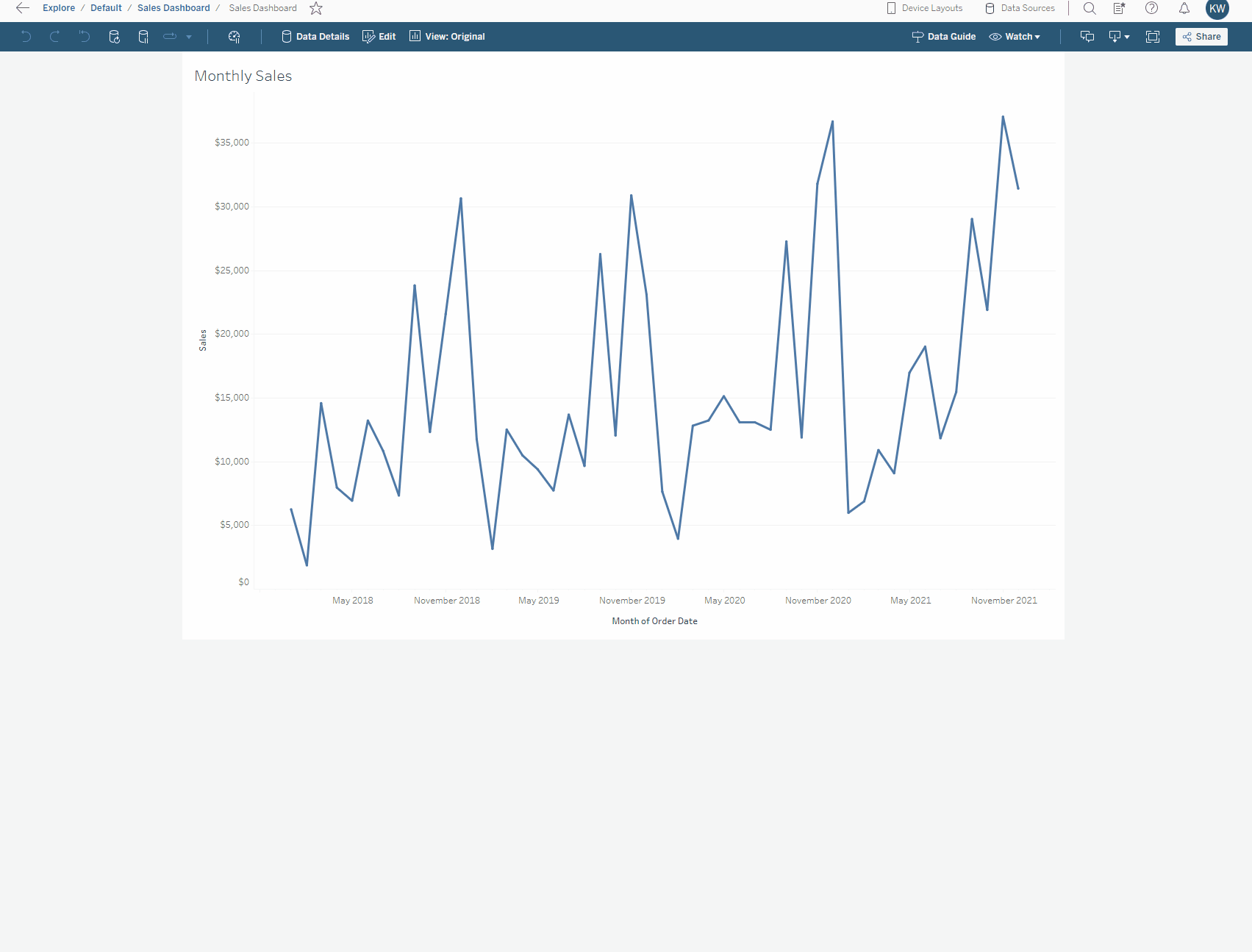
When businesses progress along the data maturity scale, the volume of data and associated dashboards will start to expand. This is great news! But, it can cause problems along the way. It is likely that your Tableau estate can start getting more difficult to navigate, and some users might get bogged down into much detail. Maybe sometimes users find themselves jumping from dashboard to dashboard to find the information they want. This is not necessarily a bad place to be. If you’re hearing these complaints, it means your end users are using data, they want more of it, and they want it both easier and faster.
At this point, it’s definitely good to start thinking about your data driven KPI’s (Key Performance Indicators) and ensuring that the business is tracking these appropriately perhaps on a summary dashboard.
But Which of Your Metrics Are “Key?”
That’s definitely a question I’ve asked more than once, and it’s an important consideration in a business. KPI’s can often be subjective, they can change regularly and what are one person’s Key Performance Indicators may not necessarily be what another person should be focusing on. Key metrics may change for many reasons: perhaps a change in strategy, refinement of metrics (for example, two KPIs may have been measuring a very similar thing) or just change of opinion.
Sometimes, as a dashboard developer, this can be very frustrating. Imagine that you’ve finally finished that beautiful executive dashboard — you’ve made your sparklines, you’ve made your BANs, you’ve finally found the perfect up and down arrow indicators — and then suddenly you need to redesign or rebuild as the KPIs have changed. Gah.
When designing summary dashboards, this change can lead into a cycle of constant rework. In light of this, I think that we need to be able to take a flexible approach, and so we need ways to help you respond to these changes quickly and easily.
So, let’s look into how we can help you manage those metrics in Tableau.
So What Are “Metrics?”
In Tableau, this is a feature in Server or Cloud which allows you to generate an overview of a selected measure without the need for custom development in Tableau Desktop. They only exist in Tableau Server or Tableau Cloud and are created from existing published workbooks. They can be found under the “Explore” option and are a distinct content type. Metrics are a single BAN (big ass number) which shows the latest value for a given measure in a given timeframe and may also include a sparkline and a comparison value with an up/down arrow.
The great things about metrics is that the work to create the BAN, sparkline and comparison indicator are all done for you automatically by Tableau. All you need to do as the creator of the metric is to define which measure you want to track (applying any relevant filters) and what time period (if any you want to compare to). The most common way to use metrics will be to track the month-on-month or year-on-year change for a variety of metrics.
Users are then able to favorite metrics which are relevant to their job role and also add them to the collections space if this is used within your organisation. Permissions are controlled like other content in Tableau Server/Cloud, with the ability to control which user groups can view and edit the metrics.
Watch the short video below on how to create a metric from a simple dashboard:
FAQ’s
Can I add metrics to a dashboard?
No, metrics exist only in Tableau Server/Tableau Cloud and cannot be connect to in Desktop or Web edit. As discussed, different teams will want to see different metrics, so leaving it up to the user which metrics are favorited should mean there is less work to add metrics in bespoke dashboards.
Can users view metrics on their mobile phone?
Yes! Metrics have been built with mobile and tablet use in mind and appear nicely on your device. You can view the headline numbers and associated sparklines in a list or on a grid and are able to click in to explore past values.
When I create a metric, where does it go? Which project folder?
This can be set when you are creating the metric, but by default, metrics get saved to the same project that the view you are creating it from belongs to.
What are the required permissions?
Metrics are created from views in published workbooks. Users can create metrics if they:
- Are a Creator or Explorer (can publish) site role
- Have the Publish capability on a project
- Have the Create/Refresh Metric capability for the relevant workbook
Note: Prior to 2021.3, the ability to create a metric on a view was controlled by the “Download Full Data” capability.
The permissions for metrics are managed independently from the view they were created from.
Do filters on the view that I make the metric from apply to the metric?
Yes, any filters that are applied to the view at time of creation will also apply to the metric. This includes both filters exposed on a dashboard and those that are not, so it is important that you are aware of these filters and name the metric accordingly.
Once I’ve made a metric, can I edit it? And add/remove filters?
In the 2022.2 release, Tableau have added the ability to edit the configuration of your metrics without needing to delete and remake. So you can change the date range and settings of the comparison line. What you can’t do, however, is add or remove filters that apply to the filter. This still needs to be done in the view that you create the metric from.
How do I configure the date axis?
When creating a metric, you can set the time period that the date axis covers. The defaults change depending on the date part being used (weeks, months etc.). If you want to set a date range not shown in the default list, you can use the custom option. This will show the “Relative window” box, which controls the number of data points that will be shown in your metric timeline. So, if your data is at month-level, it will show the last x months, or if your data is at week-level, it will show the last x weeks. Another option is to use the custom start date option. This will allow you to hard code a start date and then, as extra data gets added, the time window shown will increase.
What does “compare to how many months” mean?
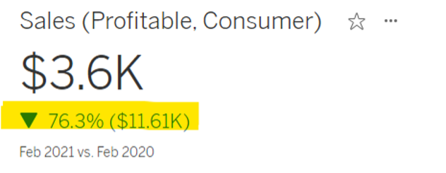
This controls the comparison value used to calculated the percentage and actual change (as highlighted below). So if the latest value in your data is for September 2023 and you enter “1” in this box, the percentage change will show the change from August 2023. Alternatively, if you want to see annual change (vs. September 2022) and you are using month data, you would need to enter “12” in this box.
Why am I getting the message: “You can’t create a metric on this chart because the date parts on the axis don’t identify an exact date.”
Normally, this occurs because your chart is aggregating multiple years’ worth of data, Tableau needs to be able to identify a single date part, so using a continuous date is usually the best solution here. For example, when looking at month-level dates, the date must include the year and month using a continuous pill.
When I click on the metric, why does it say “There is no timeline for this metric?”
This may appear when custom range relative months is set to “0.”
Why is my metric not comparing the same months?
Don’t get confused between the “date range” which controls how many date parts are shown in the timeline and “compare to how many months prior,” which controls the percentage change comparison. Be mindful that if you compare to three months prior and select the “show comparison line” checkbox, then the second line will show the metric offset by three months (I like to think of this as giving the same output as the LOOKUP function.)
If I delete the connected view/the workbook that the metrics was created from, what happens to the metric?
The metric will remain. However, if a metric isn’t able to access the connected view or its underlying data, the refresh will fail.
Closing Thoughts
Tableau Metrics are a great way to keep track of KPI’s and remove the need for time consuming custom development. They are simple to use and the consistent, clear visualisation means end users will have quick speed to insight. As metrics exist only in Server/Cloud and cannot be added to dashboards, it is imperative to have well thought out titles and descriptions and for users to understand how to navigate the platform well. Using the favourites or collections functionality is a great way to ensure that the right metrics will be found by the right users.