As data grows more and more entrenched into everyday business decisions, the importance of questioning our data and how we interpret it becomes vital. At InterWorks, we work with all different types of data, organizations and decisions. We know the impact that data can have, which is why we find it necessary to think about how to visualize data responsible, accessibly and effectively.
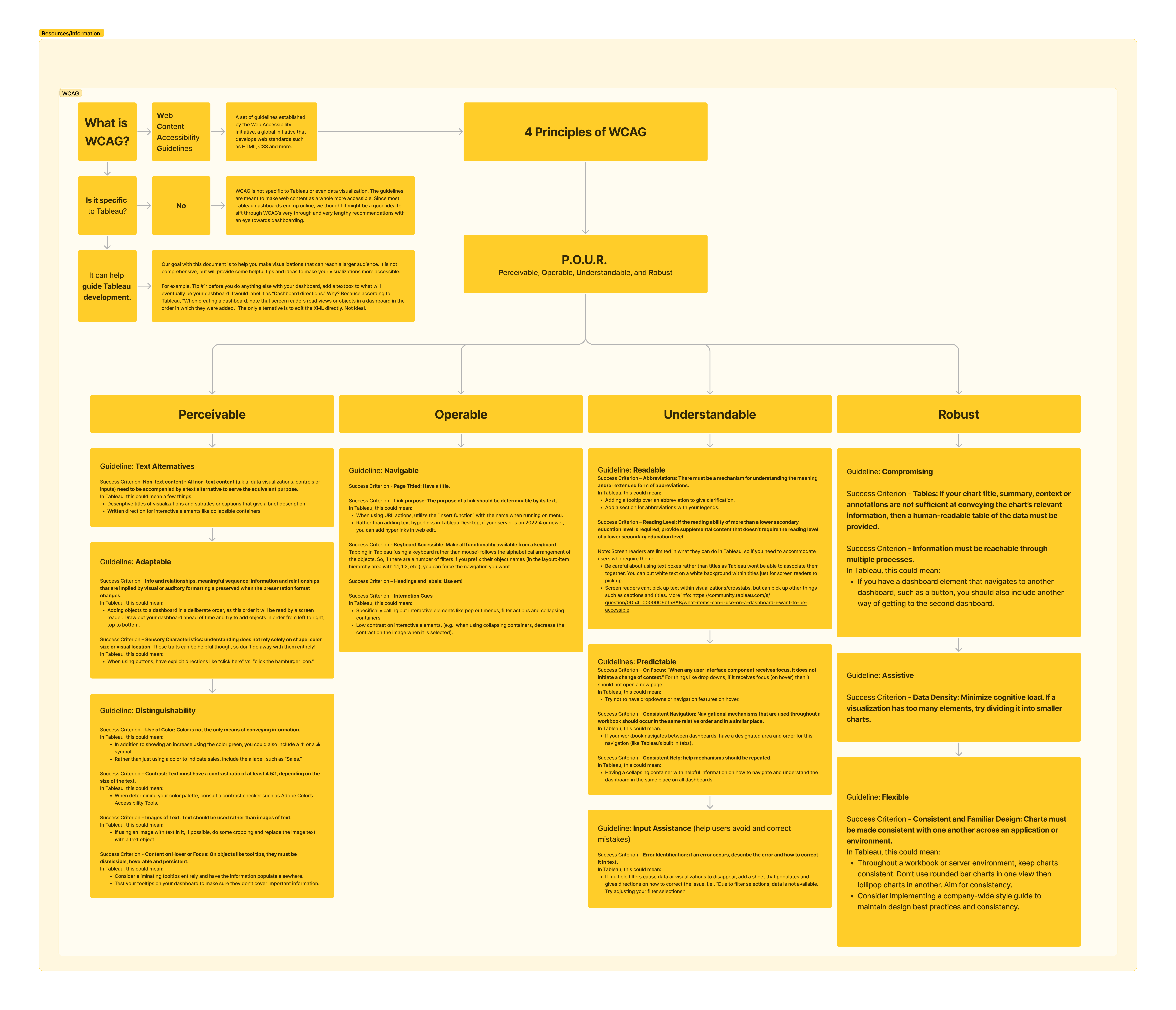
That is why Emily Miley and I decided to review the Web Content Accessibility Guidelines with the goal of applying these principles to Tableau dashboarding. The Web Content Accessibility Guidelines is a global initiative that is used far and wide to try to make anything that appears on your screen as accessible as possible.
While these SparkNotes are more Tableau centric, we believe they can relate to any form of data visualization. With the help of multiple InterWorkers, we not only tried to compress the guidelines, but we also came up with tangible examples and applications in Tableau.
The flow shown below does not cover every way to make a dashboard more accessible, but we hope it’s a good place to start. It may seem like a daunting task with no perfect solution, but that doesn’t mean we shouldn’t try!
Click on the image below to open the full-size version in a new window.

