
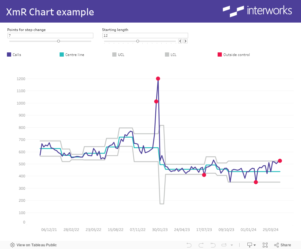
In this blog, I’ll run through the steps to build an XmR control chart, which is typically used to determine if a manufacturing or business process is in a state of control. In this example, I’m using call volume data to pick out any weeks where call volumes were outside the control limits.
What makes these charts tricky to build in Tableau is the rule specifying that if N consecutive data points are above or below the mean (centre line) then the centre line should be recalculated to the mean of those N data points (I’ve used a parameter in this example, so the user can change N from the default value of 7).
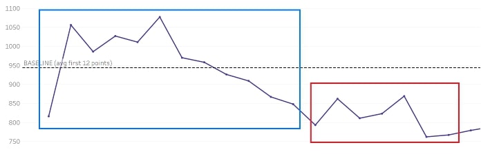
In the example below, the first 12 data points (blue box) provide the starting baseline (dotted line), but subsequent data points are all below the baseline value so the mean needs to be recalculated using N of those data points (red box):
There are already many resources online about when to use these charts and the formulas behind the values:
- Open Online Courses: XmR Charts
- Basic Tools for Process Improvement: Control Chart
- Practical Performance Measurement: XmR Charts
This post will focus on how to create those values in Tableau rather than the mathematics behind them. The following elements make up the XmR chart:
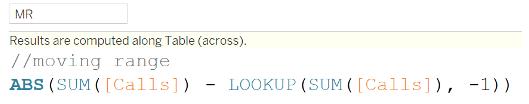
- MR (moving range) – difference to previous value
- Centre line – mean of actual values (recalculated to account for step changes)
- MR average – mean of moving range
- Control limits – upper and lower limits between where 95-99% of values sit (calculated from the centre line and MR average values)
Moving Range (MR)
This is the absolute (always positive) value calculated by subtracting the previous actual from the current actual value:
Centre Line
This value is an average of the actual values (Calls in my dataset) with the baseline set to the first N values (default is 12 in my example, and the parameter enables a user to specify the appropriate number).
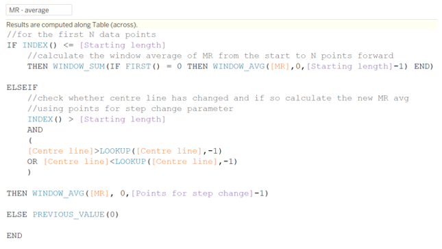
Built into this calculation is the test to determine whether N consecutive data points are above or below the centre line value and if so, to recalculate the value to be the average of those N consecutive points:
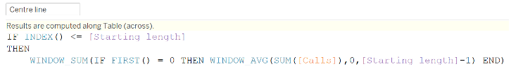
NOTE: The WINDOW_AVG() is a moving calculation, so the resulting value is different for every data point. We want the average of the first N values to be a constant, which is what the conditional statement does (by returning the first value only using FIRST() = 0), and the WINDOW_SUM() repeats that first value for every data point.
Then comes the test for consecutive values above or below the mean when we’re beyond the baseline:
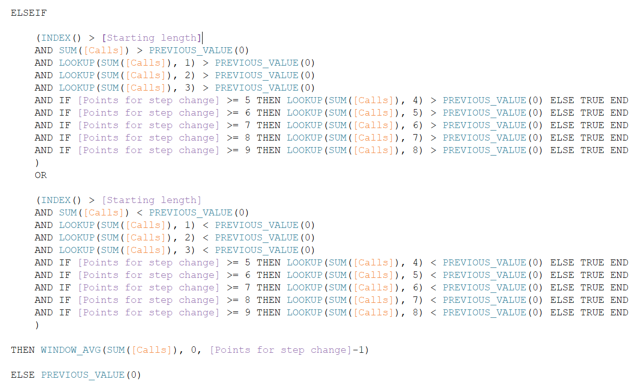
The important function here is PREVIOUS_VALUE(0) which is self-referring and, in this case, returns the baseline or recalculated centre line value. See this blog from Sebastian for more information about PREVIOUS_VALUE().
The other interesting thing here is the [Points for step change] parameter in which I’ve set allowable values between 4-9. This enables the end user to decide how many consecutive data points above/below the baseline defines a “step change” and leads to the centre line being recalculated. Because the minimum value I’ve allowed in the parameter is 4, the first four conditions are fixed with the remaining five only engaged when the value of the parameter enables them.
MR Average
This calculation is required for the control limits and, like the centre line calculation, it begins with the baseline value (mean of the first N MR values) and then recalculates if the centre line value changes:
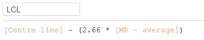
Control Limits
Control limits are calculated using the actual mean (centre line calculation) plus or minus the MR average multiplied by a constant value. This article has more detail on the constant involved, which in our case will be 2.66:
Building the Chart
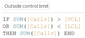
In addition to the calculations above, I created a field that only has values when they’re outside of the control limits to highlight those data points:
The chart was built by adding the call volume, centre line and control limit fields to the same axis then adding the outside control field as a dual-axis, so it could be assigned a different mark type (circles rather than lines):
Special thanks to my former colleague David Goswell who had the original request for this and to Carl Slifer who provided the methodology.