There has been much interesting debate about David McCandless’ Information Is Beautiful this week, initiated by a well written critical piece by Stephen Few. I am pleased he has challenged the orthodox view that McCandless is the answer to the data visualisation industry’s problems.
On both FlowingData and Stephen’s own blog, there is debate about the difference between “simple” and “simplistic” graphics. This is a hard point to describe, and there are two comments on Stephen’s blog (by DR, and Stephen himself) that made me realise that a picture would emphasise the difference. I wondered how McCandless, if the accusation of simplicity is correct, would rework what’s often claimed to be one of the greatest data visualisations.
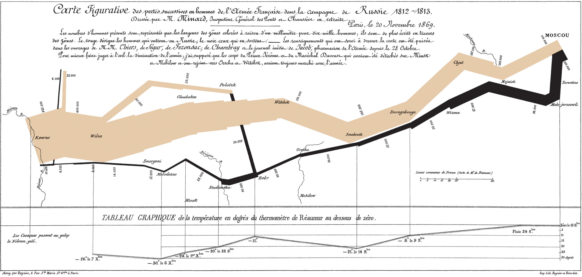
Consider the classic work by Charles Minard showing Napoleon’s disastrous 1812 march on Moscow. This graphic, I believe, fits Stephen’s definition of simple. Sure, there are many dimensions being displayed (soldier numbers, temperature, location, etc) but once the viewer understands that, the powerful anti-war message is unavoidable. The waste of life is brutally clear and well contextualised by the time location and temperature:
(image from Wikipedia: http://en.wikipedia.org/wiki/File:Minard.png)
If McCandless is to be accused of simplicity, how might a simplistic version look? I think it would be like this:
Why? The simplistic approach tries to strip away as much data as it can. Minard’s main point was the loss of life. The version above shows just that and no more. One could argue that therefore it is more effective. But it isn’t. Minard’s simple graph gives much more context without any fluff and that, to me, is the difference between “simple” and “simplistic”.
Update: Fixed the spelling of David McCandless’ name – sorry about the typos

