Cohorts have been the go-to analysis for user retention for a while now, and Tableau has a great article on how to go about creating different types of cohorts. However, when our data set is limited, we may have to create some workarounds.
An Example
The data set I’m working with is for an online service. It only tracks the day a customer signed up and the most recent date they’ve used the service.
If you do not have historical data for a customer’s login, cohort analysis can be tricky. However, given a customer’s sign up date and the most recent date they’ve used the service, we can mock up a cohort of user retention.
There is a big weakness to the following analysis: We simply don’t know if a user has been active in previous months from their most recent login. Therefore, for this report, we will define a user active for every month up to (and including) their last login.
For example: A user who signed up in January 2015 and last logged in on April 2015 would be considered an active user in both February 2015 and March 2015.
Our Workaround
We want to make sure that this distinction/limitation is clear and understood by the report consumer.
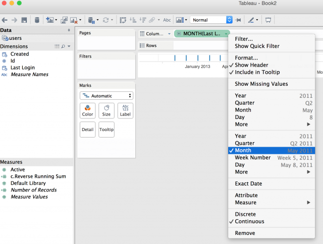
- The first thing we’re going to do is drag out our customer’s last login date (the date they joined) and change it to a Continuous Month.
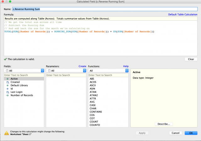
- The next step is to create a reverse running sum. Essentially we’re going to count every record starting from the last time a user logged in to the date they were created. Create a new calculated field and enter the following equation:TOTAL(SUM([Number of Records])) – RUNNING_SUM(SUM([Number of Records])) + ZN(SUM([Number of Records]))
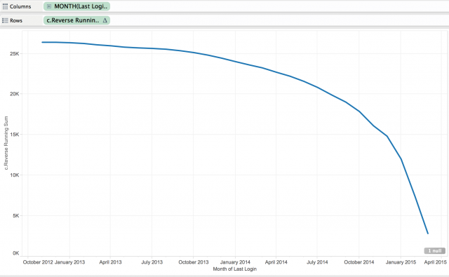
- Drag this new calculated field out to the Rows shelf:
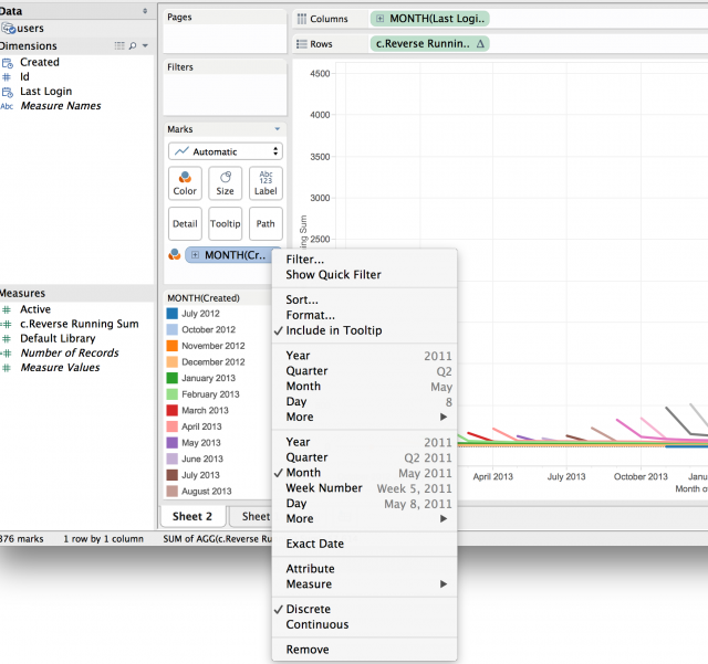
- Now we want to split this line by the month a user was created. We drag our created date into the Color button on the Marks card, and change it to Month Continuous but set to be treated as Discrete:
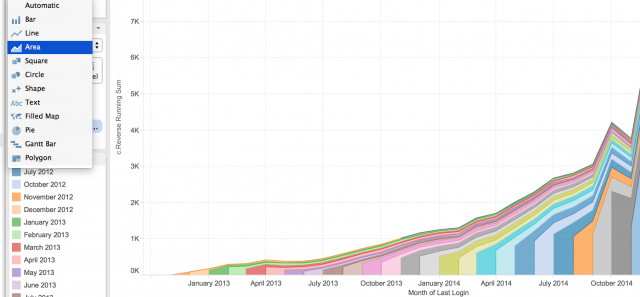
- Now, in our Marks card, let’s change our visualization to Area. I’m using an area chart in order to get the total usage over time as well as to have an understanding of what percentage of that total belongs to a specific cohort.
Below I’ve added some filters to remove null values (which, in our case, are users who have never logged in) and to only display the last eight months of data.
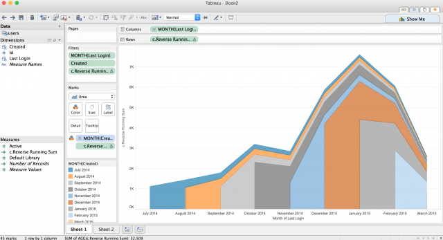
This chart represents user retention starting from the month the customer signed up and counts how many continue to use the service as time goes by, broken down by the cohort month the customer signed up.

