

Have you ever built a really cool dashboard and thought, “Man, this would be awesome to access from my phone while I’m on the go!” The world we live in today is a mobile one—we are all on the go and spending more time on our phones than ever before. According to a report by eMarketer: “In 2019, U.S. consumers will spend more time on their mobile devices than watching TV.” So, it’s no wonder that people continue to expect more and more out of their smartphones and mobile devices.
Tableau offers several features that support the creation and viewing of mobile-friendly dashboards. Tableau Desktop includes options for creating device-specific dashboards that, when published online, will automatically display depending on the user’s device. In addition, the recently updated Tableau app allows users to have a seamless experience interacting with their dashboards from their phones or tablets.
However, knowing exactly how to capitalize on these features can be tricky. Luckily for you, I’ve gone down the road less traveled, and I’m back with some tips and best practices to help you effectively and efficiently build dashboards for mobile.
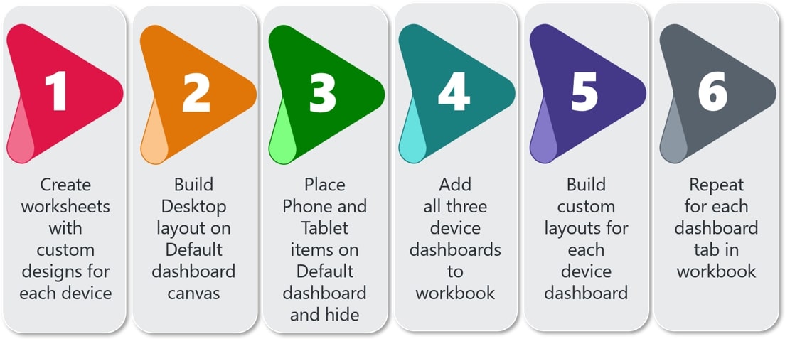
Briefly, here are the key steps to creating custom device dashboards in Tableau (and I’ll go into detail on each below):
Step 1: Create Worksheets with Custom, Device-Specific Design
When it comes to designing your dashboard for phone and tablet consumption, it’s important to consider the modified space you’ll have to build in, as well as the different user experience your viewers will have when they interact with the dashboard from a phone or tablet. This blog post doesn’t get into those details, but you can find some great tips on designing for mobile from our consultant Robert Rouse in his post.
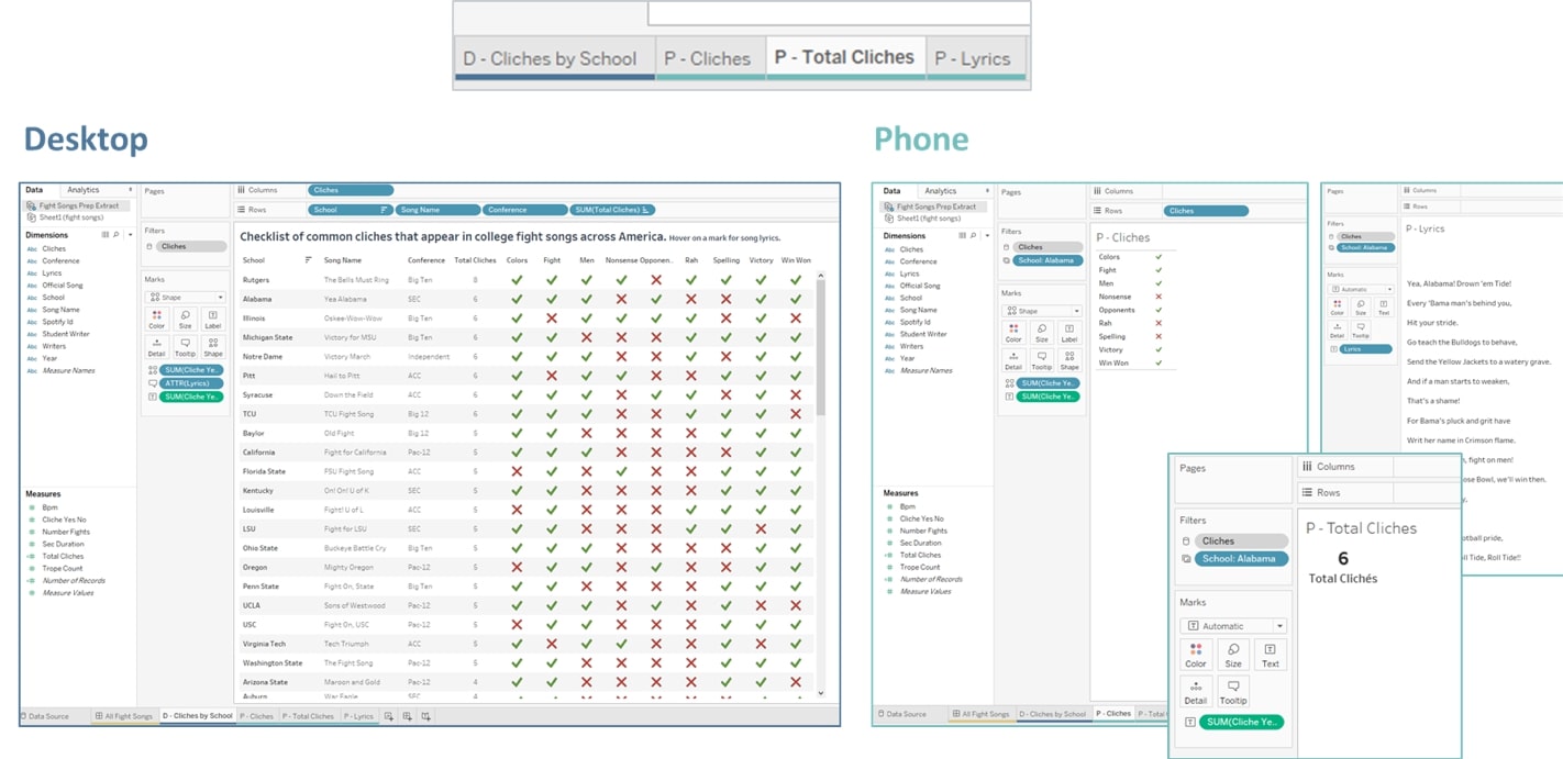
Once you’ve decided how to modify your design, you’ll want to build out your custom views on separate worksheets, like the screenshots below. I like to label my worksheets with D for Desktop and P for Phone, so I can easily distinguish between them later:
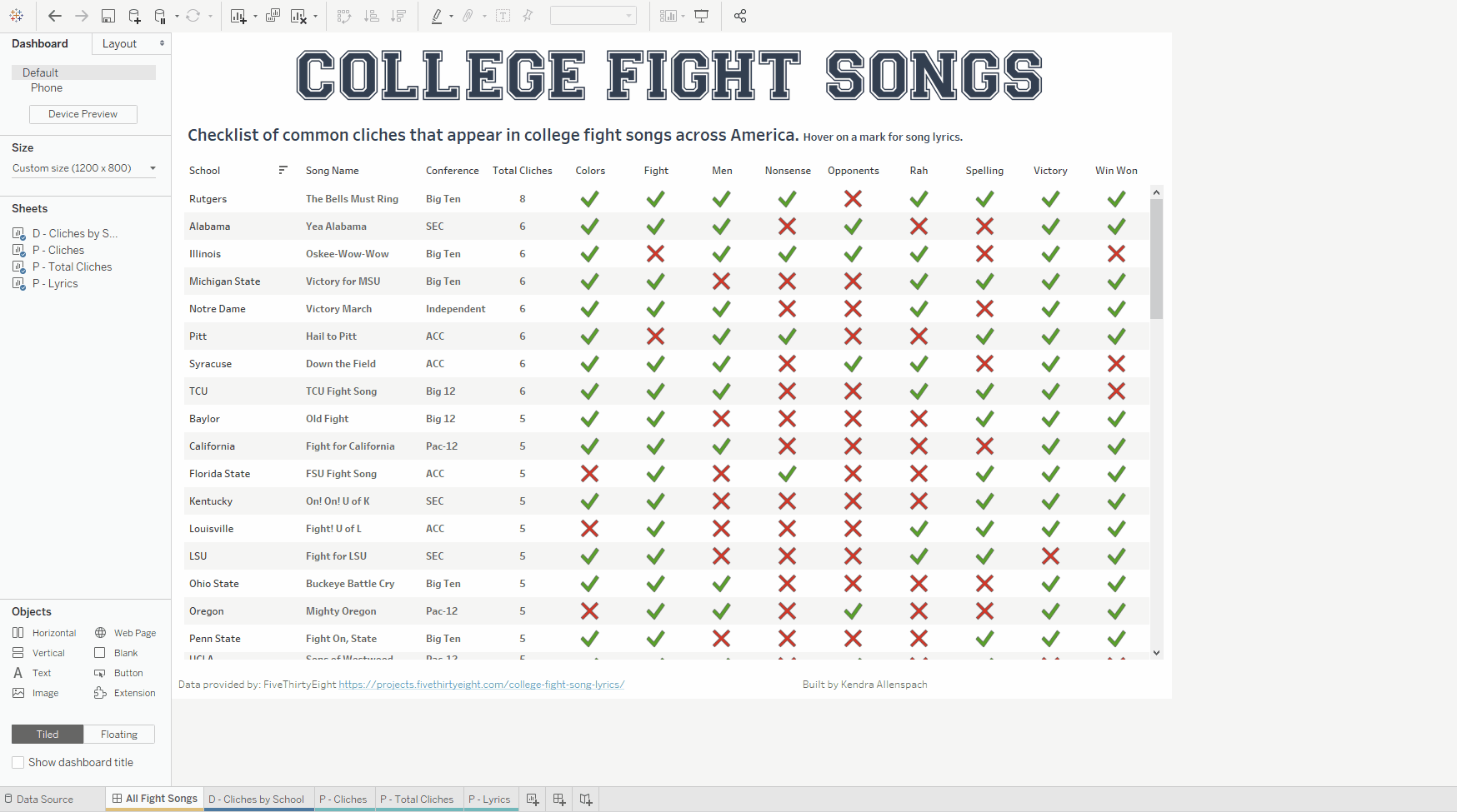
Step 2: Build Desktop Dashboard on Default Dashboard Canvas
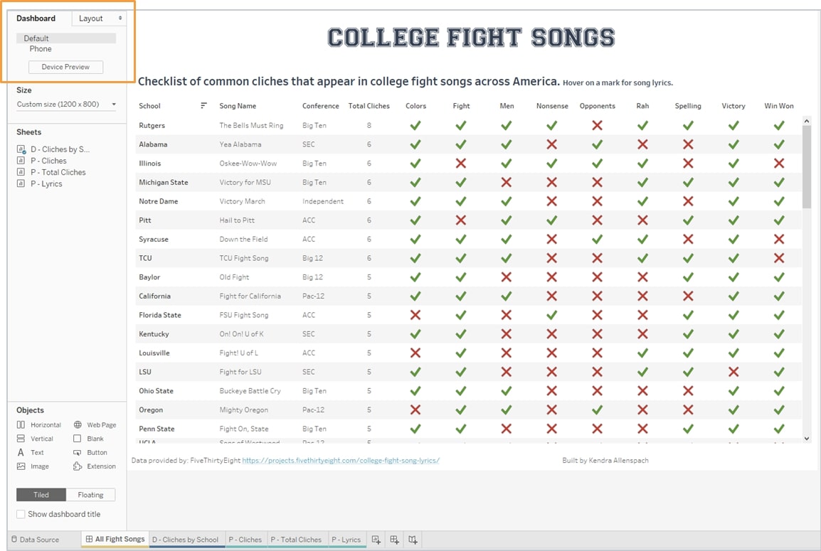
The Default dashboard is very important when it comes to creating your mobile dashboards because anything you want included on your custom mobile dashboards has to also be on the Default dashboard. Tableau recommends using the Default dashboard as a scratch-pad, but I recommend instead having your Default dashboard built for Desktop and then using hidden containers to hold your Phone and Tablet items (Step 3 below).
If you’re not familiar with the Default dashboard, it is the one Tableau automatically adds when you create a dashboard tab in your workbook. If you’ve never paid attention to Device dashboards before, you’ve most likely been building all your dashboards in the Default canvas without even realizing it. You can see which dashboard you are building by looking in the upper-left corner of Tableau Desktop. In newer versions of Tableau (beginning with 2019.1), it automatically adds a Phone dashboard for you as well.
Once you confirm you’re on the Default dashboard, go ahead and build your dashboard to be optimized for Desktop. You can see in the screenshot below I have added my sheet marked with “D” (for Desktop) onto the Default dashboard.
One note on sizing here: I like to set a fixed size for my Default dashboard; 1200 x 800 is my sweet spot. You can certainly make yours bigger, smaller, or use automatic sizing if you so desire (though I don’t recommend it). You’ll see later that we’ll keep this size from Default when we build the Desktop dashboard:
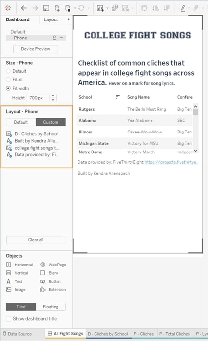
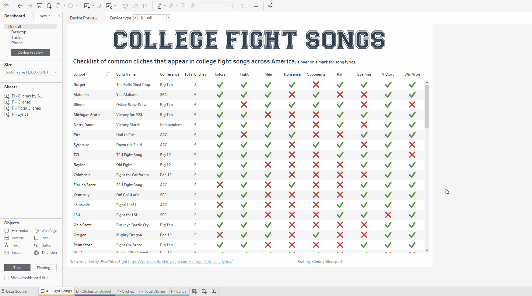
If you were to click over to the Phone dashboard that Tableau automatically adds to your workbook, you’ll see that it is essentially a shrunken-down version of your Desktop dashboard. You’ll also see that in the left-hand pane in the Layout – Phone section, none of the worksheets you specifically built for Phone are available to add to your Layout. This is because you can only choose from items (worksheets, images, filters, etc.) that are also on your Default dashboard. That leads us to Step 3.
Step 3: Place Custom Phone and Tablet Items in Floating Containers
Since we will want to keep our Default dashboard looking nice and neat but still add in our custom Phone worksheets, we’ll do so using Tableau’s new 2019.2 feature for hidden containers. This way, our floating containers on the Default layout can remain hidden.
Head back to your Default dashboard, and add in a Vertical layout container from the Objects menu on the bottom left. Next, drag in all your custom Phone worksheets to the container. Then add in any filters, images, etc. you’ll want on your Phone dashboard. Once you have everything added, you can go to the vertical container menu, and select Add Show/Hide Button. I like to change my button to a text button with a P (for Phone), set the font color to white so it’s truly hidden and then place it in the bottom-right corner of my Default dashboard so it’s not in the way:
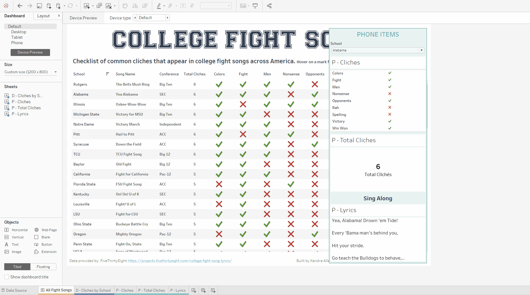
Now, select your Phone dashboard, and you’ll see your Phone items available to add to your custom Phone layout. Repeat this same action for Tablet items, or (like in my example) you can use the same items you are using for Desktop for Tablet.
Step 4: Add Device Dashboards to Your Workbook
As mentioned before, Tableau automatically adds Phone dashboards to your workbook when you create a new dashboard tab. However, in order for your dashboards to render correctly across all devices, I recommend adding dashboards for Desktop and Tablet, too. Based on my testing, adding custom device dashboards for Phone, Desktop and Tablet is the most surefire way for the correct dashboard to display on each respective device type.
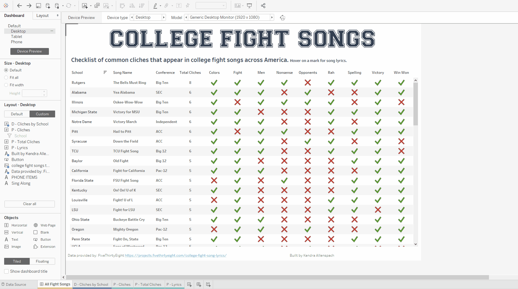
To do this, go back to your Default dashboard, turn on Device Preview and scroll to the Device Type: Desktop in the top menu. Then select Add Desktop Layout. What Model you have selected when you do this doesn’t matter if you plan on using the same size settings for Default as for your Desktop dashboard. When you scroll through the Model options, it will preview for you what your dashboard will look like on the different models, but you don’t have to build a separate dashboard for each Model—only for the different device types. Repeat this step for adding a Tablet dashboard as well:
Step 5: Build Custom Layouts for Each Device Dashboard
Now you can build your custom device dashboards! First, select Desktop. Here are some best practices for your Desktop settings:
- Size: Select Default. This will have your Desktop dashboard retain whateversSize you selected for your Default dashboard before. If you choose Fit Width or Fit Height and scroll through the Models in Device Preview, you can see how your dashboard will adjust to fill the space. In my example, I have my Default set to fixed size 1200 x 800, so regardless of what Model I preview, my dashboard will remain that desired size.
- Layout: Select Custom. Even though we want the Desktop dashboard to look just like our Default, I selectCcustom so that I can delete the hidden containers with the Phone/Tablet items as they’re not necessary in this view.
Next, select Phone from the dashboards. Now that your Phone items are available in the Layout pane, you can remove the Desktop-specific items by selecting Custom in the Layout pane on the left and replace them with your Phone-specific items. Here are some best practice tips for your Phone dashboard settings:
- Size: Select Fit Width. You can customize your height based on how much content you have and how far you want your users to scroll. (Beware of scrolling inception, though!)
- Layout: Select Custom. This way, you can remove your Desktop items and create a custom layout with your Phone I recommend adding your Phone items to your dashboard as tiled objects, not floating.
Finally, select Tablet from the dashboard list. Even if you don’t think your users will be using tablets, I still recommend creating Tablet dashboards. In this example, my Tablet dashboard is going to be the same as my Default and Desktop dashboards. Here are some best practice tips for your Tablet dashboard settings:
- Size: Select Default. Since my Default is set to 1200 x 800, this is a safe size for tablets. If your Default is larger than this, I recommend choosing a different option here, such as Fit All or Fit Width.
- Layout: Select Custom. Again, even though we want our Tablet dashboard to look just like our Default, I select Custom so that I can delete the hidden containers with the Phone/Tablet items as they’re not necessary in this view.
Step 6: Repeat for All Dashboard Tabs in Your Workbook
This is a very important step. Even if you are not planning on publishing all dashboard tabs in your workbook, or not all tabs need device-specific views, EVERY dashboard tab in your workbook needs to have the device-specific dashboards for Tableau to correctly render the device views when displayed on various devices. I am not quite sure why this is, but I ran into issues when I didn’t follow this step. If you have a lot of dashboard tabs in your workbook that aren’t being published, you should at least add the three device dashboards for them, even if they’re not formatted for publication.
Step 7: Test, Test, Test!
And lastly, the most important step in my opinion, is to test your dashboard on the actual devices. Tableau Server now offers Device Previews when you publish your dashboard from Desktop, but in my experience, these previews are not the most reliable. The best way to know how your dashboard will look for your users is to use your phone, your tablet and, if different from yours, your users’ phones/tablets and then view AND interact with your dashboard:
That wraps up the steps and tips for building mobile dashboards in Tableau! I hope you found this blog helpful. If you have any questions about the topics covered, please don’t hesitate to reach out to me directly. The dashboard associated with this blog is available on Tableau Public for you to download and look at in Tableau Desktop if you want to see firsthand how I built it. Happy dashboarding!
The Latest
-

Kickstarting Data Innovation in Healthcare
18 April, 2024